


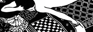

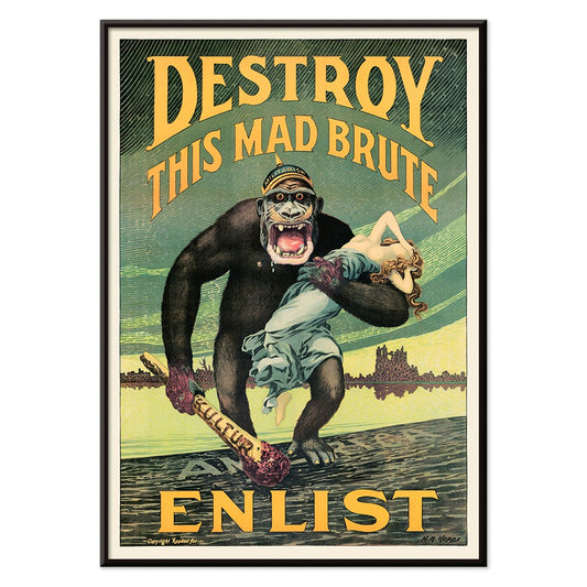
- Destroy this mad brute Poster
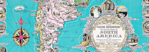
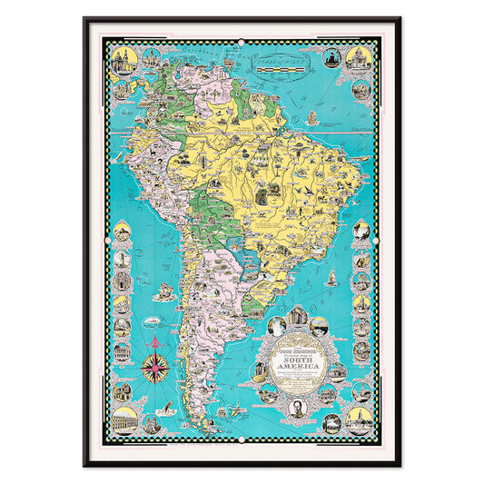
- The good neighbor of South America Poster
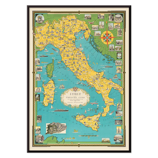
- Italy with Vatican City Poster
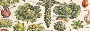
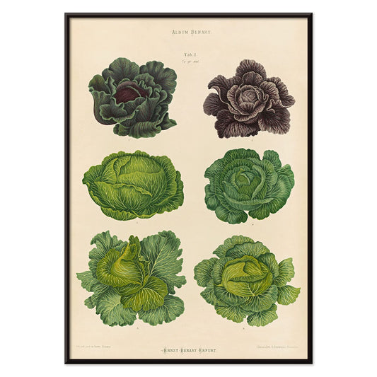
- Radishes Poster
- Carrots Poster
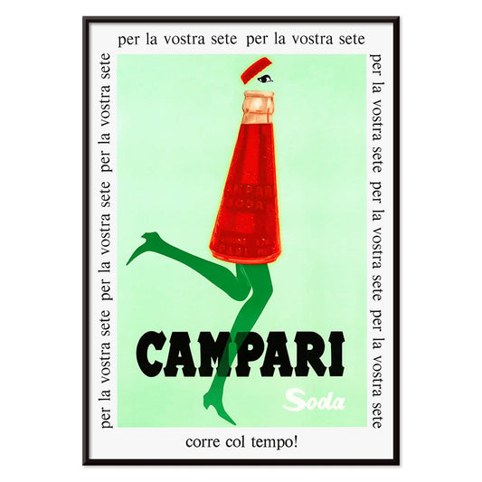
- Campari Soda Poster
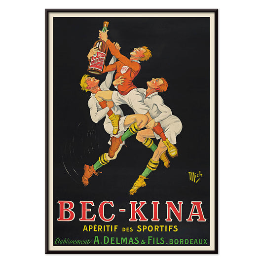
- Bec-Kina Poster
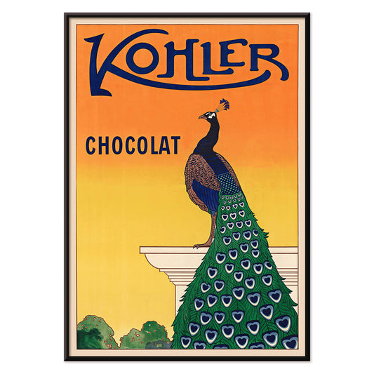
- Kohler Chocolat Poster
- Strawberry Thief Poster
- Tom Krojer Exhibition Poster Poster
- Berlin Street Scene Poster
- Woman Seated Back Poster
- Park Near Lu Poster
- El Comienzo Poster
- Parler Seul Poster
- Faun and Nymphe Poster
- Female Artist Poster
- Visit Puerto Rico Poster
- The Jefferson Airplane Poster
- Kyushu-Okinawa Poster
- Xerez Pedro Domeco Poster
- Continental Hawaii Airline Poster
- Beer and Cigarette Poster
- West Coast of Mexico Poster
- El Maestro 1 Poster
- Cannabis Plate 2 Poster
- L'Art Independant Poster
- Swing into books Poster
- Mexican Art & Life 1 Poster
- Mexican Art & Life 4 Poster
- Mexican Art & Life 3 Poster
- The Ornamental Arts Of Japan IX Poster
- Joyful Mountain Poster
- Prunus avium Poster
-
Destroy this mad brute Poster
Harry Ryle Hopps · 1917 · Dramatic wartime poster featuring a helmeted gorilla advancing with club and captive
Poster from £9 · Framed from £16
Regular price From £6.00Regular price -
The good neighbor of South America Poster
Ernest Dudley Chase · 1935 · Bright illustrated South America map poster with animals, landmarks, and sea routes
Poster from £9 · Framed from £16
Regular price From £6.00Regular price -
Italy with Vatican City Poster
Ernest Dudley Chase · 1935 · Illustrated Italy map poster featuring landmark vignettes and crisp lettering in vibrant colors
Poster from £9 · Framed from £16
Regular price From £6.00Regular price -
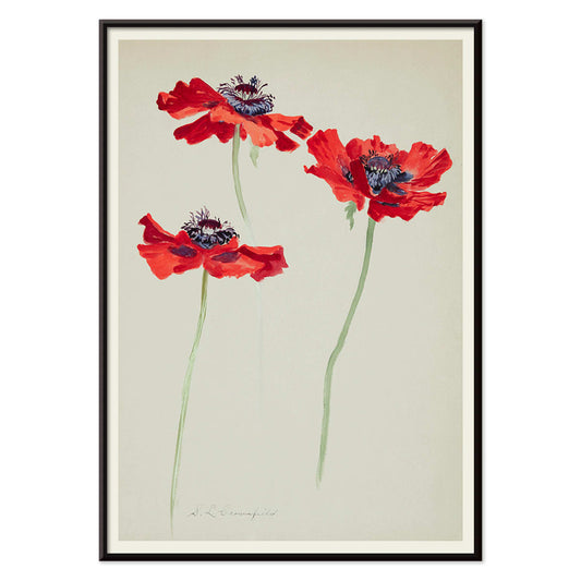
Three Studies of Poppies Poster
Sophia Crownfield · 1900 · Delicate botanical print presenting three poppy studies with vivid petals and slender stems
Poster from £9 · Framed from £16
Regular price From £6.00Regular price -
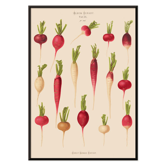
Radishes Poster
Ernst Benary · 1876 · Detailed radishes print showcasing crisp roots and leafy tops on warm beige
Poster from £9 · Framed from £16
Regular price From £6.00Regular price -
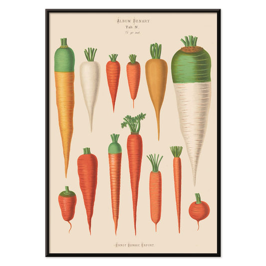
Carrots Poster
Ernst Benary · 1876 · Detailed botanical print of heirloom carrots with leafy tops on warm beige plate
Poster from £9 · Framed from £16
Regular price From £6.00Regular price -
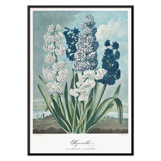
Hyacinths Poster
Robert John Thornton · 1807 · Elegant hyacinths botanical print with pale blooms and sculptural green leaves
Poster from £9 · Framed from £16
Regular price From £6.00Regular price -
Campari Soda Poster
Unknown artist · 1932 · Playful Campari Soda advertising poster with a strolling bottle against deep black
Poster from £9 · Framed from £16
Regular price From £6.00Regular price -
Bec-Kina Poster
Michel Liebeaux · 1900 · Energetic rugby themed aperitif poster with bold figures reaching for a bottle
Poster from £9 · Framed from £16
Regular price From £6.00Regular price -
Kohler Chocolat Poster
F. Champenois · 1914 · Elegant Art Nouveau peacock poster advertising Kohler chocolate on a radiant orange background
Poster from £9 · Framed from £16
Regular price From £6.00Regular price -
Cabbages Poster
Ernst Benary · 1876 · Crisp botanical print of green and purple cabbages with delicate naturalist shading
Poster from £9 · Framed from £16
Regular price From £6.00Regular price -
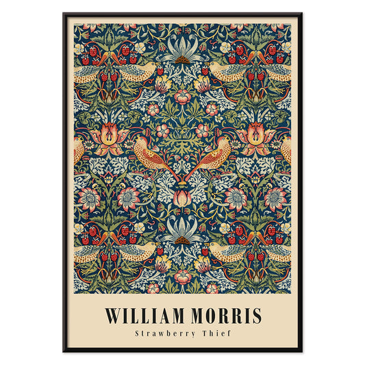
Strawberry Thief Poster
William Morris · 1883 · Iconic Arts and Crafts poster with thrushes, strawberries, and scrolling foliage in rich blues
Poster from £9 · Framed from £16
Regular price From £6.00Regular price -
Eglantier Poster
Maurice Pillard Verneuil · 1896 · Graceful wild rose art print with flowing stems, leaves, and delicate blossoms
Poster from £9 · Framed from £16
Regular price From £6.00Regular price -
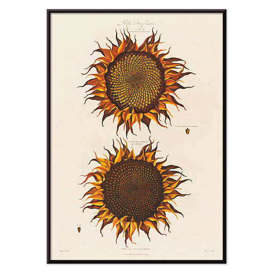
Ripe Sunflower Poster
Robert John Thornton · 1799 · Dramatic ripe sunflower botanical print with curling petals and lush green leaves
Poster from £9 · Framed from £16
Regular price From £6.00Regular price -
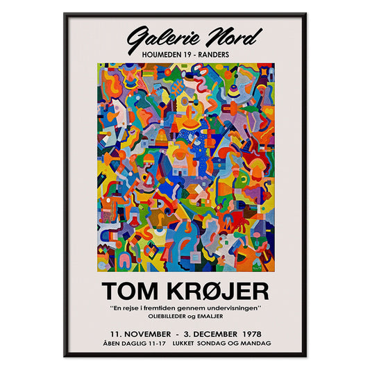
Tom Krojer Exhibition Poster Poster
Tom Krojer · 1989 · Dynamic geometric exhibition poster balancing vivid color blocks with crisp modern typography
Poster from £9 · Framed from £16
Regular price From £6.00Regular price -
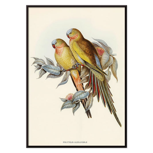
Polytelis Alexandrae Poster
Unknown artist · 1873 · Elegant parakeet print featuring two long-tailed birds in fresh green and rose hues
Poster from £9 · Framed from £16
Regular price From £6.00Regular price -
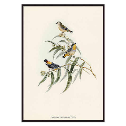
Pardalotus Xanthopygius Poster
Unknown artist · 1838 · Delicate pardalote print with three birds perched on eucalyptus branches in soft natural tones
Poster from £9 · Framed from £16
Regular price From £6.00Regular price -
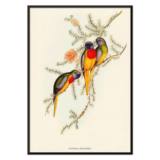
Euphema Splendida Poster
Unknown artist · 1848 · Detailed parakeet print with three birds perched among leafy branches
Poster from £9 · Framed from £16
Regular price From £6.00Regular price -
Berlin Street Scene Poster
Ernst Kirchner · 1913 · Dynamic Berlin street poster with angular figures, bright color blocks, and nightlife energy
Poster from £9 · Framed from £16
Regular price From £6.00Regular price -
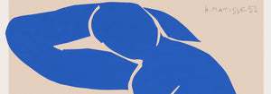
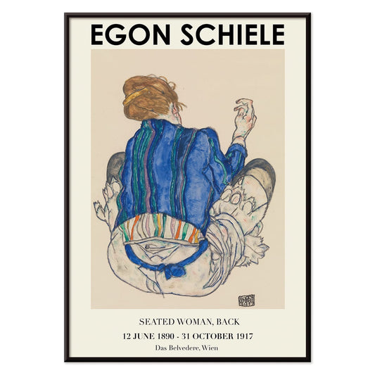
Woman Seated Back Poster
Egon Schiele · 1917 · Expressive figure art print of a seated woman from behind in earthy tones
Poster from £9 · Framed from £16
Regular price From £6.00Regular price -
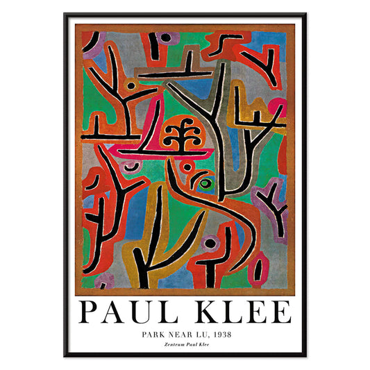
Park Near Lu Poster
Paul Klee · 1938 · Dreamlike abstract landscape art print with rhythmic blocks suggesting a quiet park
Poster from £9 · Framed from £16
Regular price From £6.00Regular price -
El Comienzo Poster
Joan Miro · 1972 · Playful abstract poster with biomorphic shapes and bold lines in vivid primary colors
Poster from £9 · Framed from £16
Regular price From £6.00Regular price -
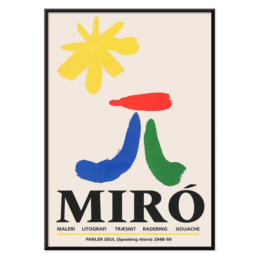
Parler Seul Poster
Joan Miro · 1948 · Playful abstract poster with floating symbols, bold lines, and primary color accents
Poster from £9 · Framed from £16
Regular price From £6.00Regular price -
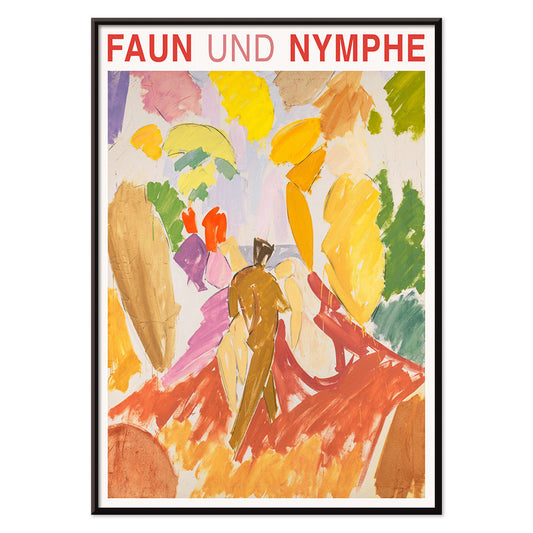
Faun and Nymphe Poster
Edvard Weie · 1941 · Expressive mythic poster pairing a faun and nymph in bold modernist color blocks
Poster from £9 · Framed from £16
Regular price From £6.00Regular price -
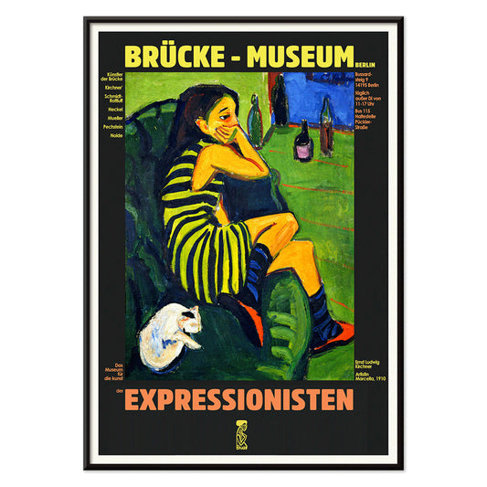
Female Artist Poster
Ernst Ludwig Kirchner · 1910 · Angular figure art print with bold black contours and high-contrast color fields
Poster from £9 · Framed from £16
Regular price From £6.00Regular price -
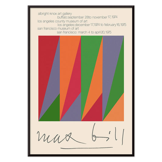
Max Bill Poster
Max Bill · 1974 · Geometric abstract poster with interlocking forms in vivid red, orange, green, and purple
Poster from £9 · Framed from £16
Regular price From £6.00Regular price -
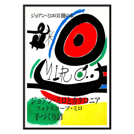
Joan Miro Osaka Poster
Joan Miro · 1970 · Playful abstract poster with calligraphic black forms and bright primary accents
Poster from £9 · Framed from £16
Regular price From £6.00Regular price -
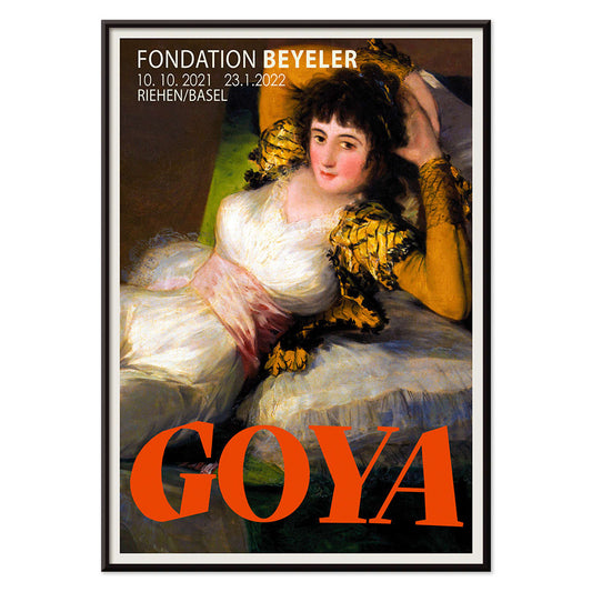
The Clothed Maja Poster
Francisco Goya · 1802 · Iconic reclining figure art print with crisp whites, green sash, and golden cushions
Poster from £9 · Framed from £16
Regular price From £6.00Regular price -
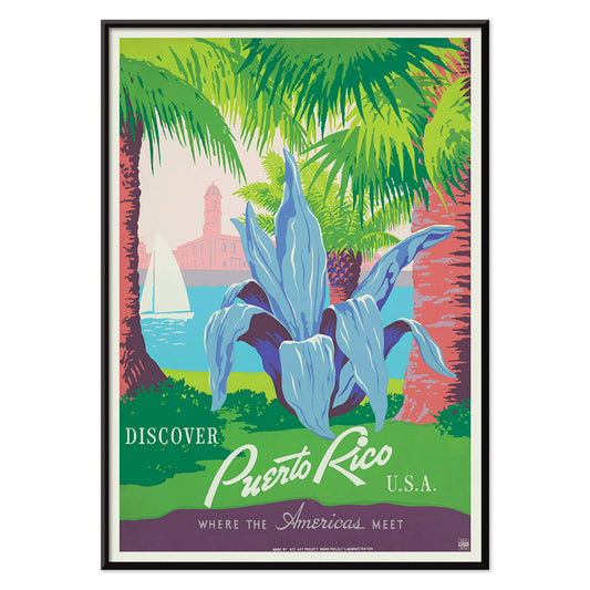
Visit Puerto Rico Poster
Unknown artist · 1950 · Mid-century Puerto Rico travel poster featuring a sailboat and historic coastal fort
Poster from £9 · Framed from £16
Regular price From £6.00Regular price -
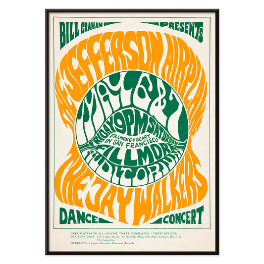
The Jefferson Airplane Poster
Wes Wilson · 1966 · Psychedelic Jefferson Airplane poster with swirling typography and vivid green-orange contrast
Poster from £9 · Framed from £16
Regular price From £6.00Regular price -
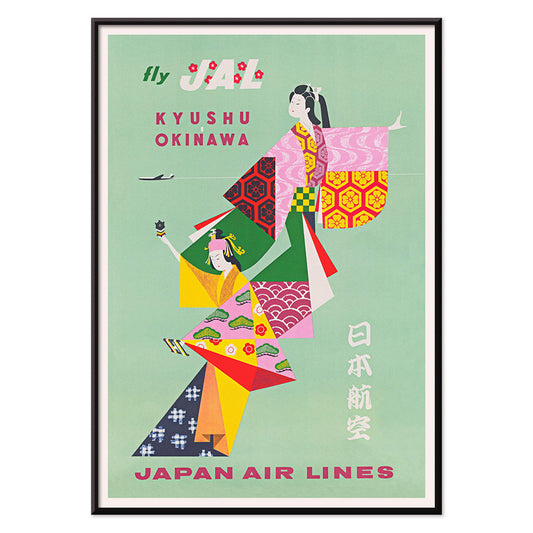
Kyushu-Okinawa Poster
Unknown artist · 1962 · Vibrant Japanese travel poster featuring traditional figures and bold island-inspired graphic shapes
Poster from £9 · Framed from £16
Regular price From £6.00Regular price -
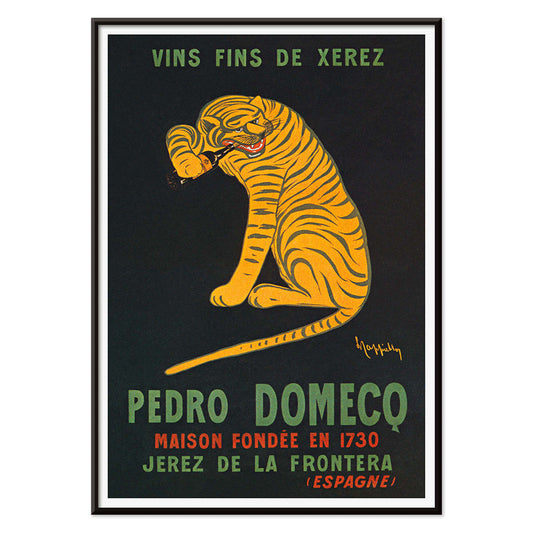
Xerez Pedro Domeco Poster
Leonetto Cappiello · 1930 · Iconic tiger poster leaping from deep black to advertise Xerez sherry
Poster from £9 · Framed from £16
Regular price From £6.00Regular price -
Sur la Cote d'Azur Poster
Roger Broders · 1950 · Sunlit Riviera poster with stylized beachgoers, sailboats, and bold Art Deco forms
Poster from £9 · Framed from £16
Regular price From £6.00Regular price -
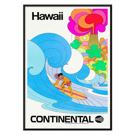
Continental Hawaii Airline Poster
Unknown artist · 1960 · Joyful Hawaii surf poster with lei-wearing surfer and psychedelic flower backdrop
Poster from £9 · Framed from £16
Regular price From £6.00Regular price -
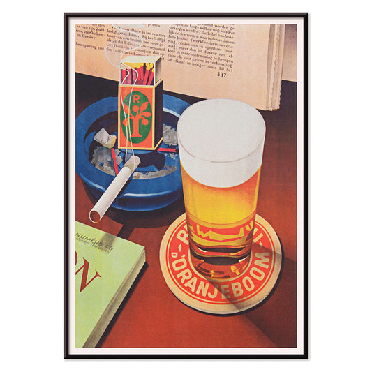
Beer and Cigarette Poster
Unknown artist · 1935 · Graphic beer and cigarette poster featuring a foaming glass and bold red and blue accents
Poster from £9 · Framed from £16
Regular price From £6.00Regular price -
West Coast of Mexico Poster
Ray Bethers · 1935 · Sunlit coastal village poster with palms, blue sea, and bold travel typography
Poster from £9 · Framed from £16
Regular price From £6.00Regular price


36/715 items
- Destroy this mad brute Poster
- The good neighbor of South America Poster
- Italy with Vatican City Poster
- Radishes Poster
- Carrots Poster
- Campari Soda Poster
- Bec-Kina Poster
- Kohler Chocolat Poster
- Strawberry Thief Poster
- Tom Krojer Exhibition Poster Poster
- Berlin Street Scene Poster
- Woman Seated Back Poster
- Park Near Lu Poster
- El Comienzo Poster
- Parler Seul Poster
- Faun and Nymphe Poster
- Female Artist Poster
- Visit Puerto Rico Poster
- The Jefferson Airplane Poster
- Kyushu-Okinawa Poster
- Xerez Pedro Domeco Poster
- Continental Hawaii Airline Poster
- Beer and Cigarette Poster
- West Coast of Mexico Poster
Why green keeps returning
Green in vintage poster culture is rarely a single hue; it works as a punctuation mark, chlorophyll against cream paper, emerald shadows in a lithograph, a muted olive that softens a room. From 19th-century verdigris to mid-century inks, green signaled gardens, hygiene, and new leisure. This is a color-led way to build wall art and decoration, moving easily between botanical and abstract, without forcing everything to match.
Pattern, pigment, and a little science
Designers have long used green to make surfaces feel alive. In Eugène Chevreul’s Cercle chromatique, the spectrum is laid out like a tidy argument: greens bloom between yellow and blue, then dissolve into cooler notes. That logic shaped 19th-century taste, from painters’ palettes to dyed textiles. Chevreul’s ideas traveled through poster studios, where lithographers layered translucent greens to suggest depth without heavy shading, an approach that made small green details capable of anchoring an entire composition.
How craft traditions use green
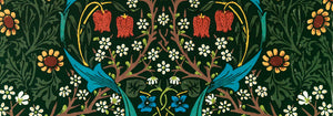
Ornament and repeat pattern give green a different job: not accent, but environment. William Morris turns theory into domestic structure in Strawberry Thief (1883) by William Morris, where birds and curling leaves lock into a repeat that feels both medieval and modern. Seen beside related work in William Morris and the broader context of classic art, the poster becomes a lesson in how green can hold busy drawing together without flattening it.
Where green wall art works hardest
In a kitchen or dining corner, green reads as appetite and freshness; pair it with matte ceramics and warm woods, or echo it with herbs on the counter. In bedrooms, choose dusty sage or forest tones to quiet bright lighting, then let linen and brass do the rest. For a restrained gallery wall, start with green-accented pieces and add neutrals from black and white; the contrast keeps the decoration from tipping into a theme. Entryways like a sharper green at eye level, while a living room can handle layered greens across two or three prints.
Curating across eras and framing choices
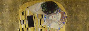
Green also bridges styles. Gustav Klimt’s The Kiss (1907–1908) by Gustav Klimt carries a deep, garden-like green that keeps the gold mosaic grounded; hang it near dark walnut or moss velvet for a softer glow. For airier calm, try the dusk gradients and river reflections of Early Autumn in Urayasu (1931) by Kawase Hasui, then connect it to panoramic companions from landscape or the wider world of oriental prints. When you want graphic punch, Hans Schleger’s Eat Greens for Health by Hans Schleger sits naturally beside advertising and bauhaus posters, where green often acts as a calm counterweight to red or black. Treat framing as part of the palette: pale oak for herbal charts, black for modern geometry, and a slim brass edge when the design already carries metallic warmth.