


- Geographical Guide to a Woman's Heart Poster
- Portugal Today Poster
- Beer and Cigarette Poster
- The New Yorker Poster
- The Floor of the Oceans Poster
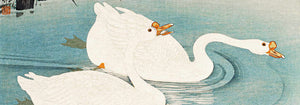
- Zoologischer Garten Poster
- Save the whales Poster
- Papiers découpés 3 Poster
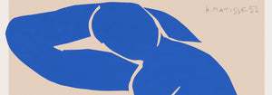
- Nu Bleu III Poster
- Marihuana Poster
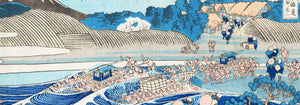
- Kanagawa Great Wave Poster
- Porto Ramos-Pinto Poster
- Grands Prix de France Poster
- Black Cat 2 Poster
- Solaris Poster
- Matisse Dancing Figures Poster
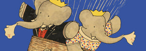
- Le Voyage de Babar Poster
- Cordial Campari Poster
- Coffea Arabica 3 Poster
- Sigmund Freud had it Poster
- Panther Poster
- The Tiger of Ryōkoku Poster
- Wake up and read Poster
- Babar en Voiture Poster
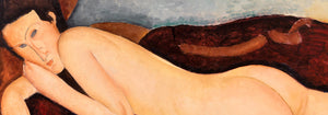
- The Dream Poster
- Barcelona Text poster Poster
- The Great Wave Poster
- The Tricolor balloon Poster
- Nu Bleu II Poster
- Star Wars AT-AT Patent Poster
- Mickey Mouse Poster
- Bleu de Ciel Poster
- Papiers découpés 1 Poster
- Sitting cat, from behind Poster
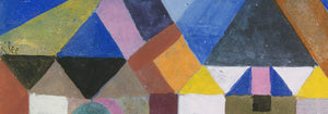
- Bauhaus Poster 2 Poster
- Bauhaus Poster 11 Poster
- Brazil 2 Poster
- Black Leopard Poster
- Histoire de Babar Poster
- Asakusa Kinryuzan Temple Poster
- Bauhaus Poster 6 Poster
- The Kiss Poster
- Surfboard Patent Poster
- Black Cat 4 Poster
- Sitting cat, facing left Poster
- Vertigo Poster
- Colorful Architecture Poster
- La Paresse Poster
- Red crown crane Poster
- Population Map Poster
-
We Can Do It! Poster
J. Howard Miller · 1942 · Bold poster with Rosie the Riveter and a strong wartime slogan
Poster from £9 · Framed from £16
Regular price From £6.00Regular price -
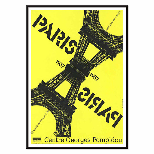
Paris-Paris 1937-1957 Poster
Roman Cieślewicz · 1981 · Paris poster with mirrored Eiffel Tower graphics and bold yellow contrast
Poster from £9 · Framed from £16
Regular price From £6.00Regular price -
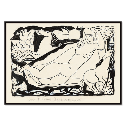
Venus Vignet Poster
Leo Gestel · 1932 · Monochrome Cubist Venus poster with swift horses and angular motion lines
Poster from £9 · Framed from £16
Regular price From £6.00Regular price -
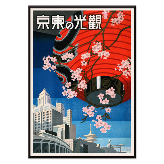
Come to Tokyo Poster
Unknown artist · 1930 · Vibrant Tokyo travel poster with red lantern and cherry blossoms on deep blue
Poster from £9 · Framed from £16
Regular price From £6.00Regular price -
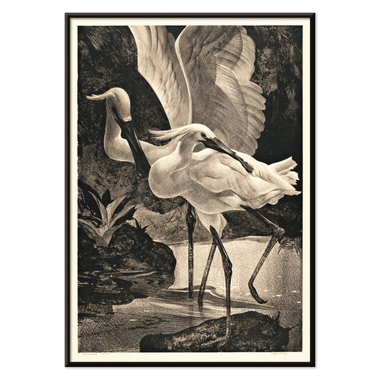
Lepelaars Poster
Adriaan van Hoff · 1923 · Elegant spoonbill poster in crisp black and white with Art Deco poise
Poster from £9 · Framed from £16
Regular price From £6.00Regular price -
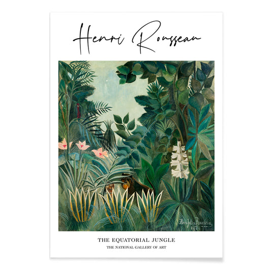
The Equatorial Jungle Poster
Henri Julien Félix Rousseau · 1909 · Dreamlike jungle poster with layered green foliage and hidden animals peering through
Poster from £9 · Framed from £16
Regular price From £6.00Regular price -
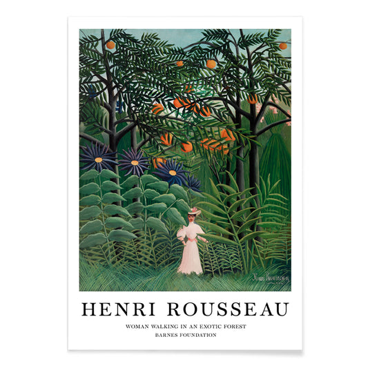
Woman Walking in an Exotic Forest Poster
Henri Julien Félix Rousseau · 1905 · Dreamlike jungle art print with a solitary woman amid layered tropical foliage
Poster from £9 · Framed from £16
Regular price From £6.00Regular price -
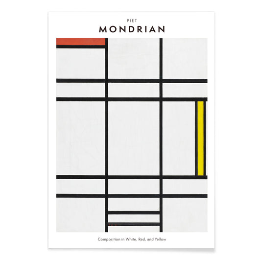
Composition in White, Red, and Yellow Poster
Pieter Cornelis Mondriaan · 1936 · Geometric art print balancing white space with crisp black lines and primary blocks
Poster from £9 · Framed from £16
Regular price From £6.00Regular price -
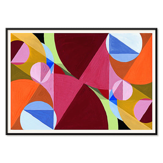
Area Broken by Perpendiculars Poster
Joseph Schillinger · 1934 · Geometric abstract poster featuring perpendicular grids and vivid color blocks in rhythmic balance
Poster from £9 · Framed from £16
Regular price From £6.00Regular price -
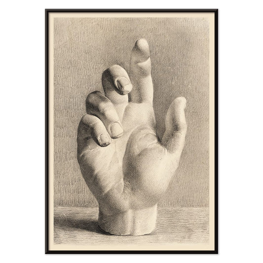
Plaster Hand Poster
Dankvart Dreyer · 1829 · Academic hand study art print with soft shading on warm beige paper
Poster from £9 · Framed from £16
Regular price From £6.00Regular price -
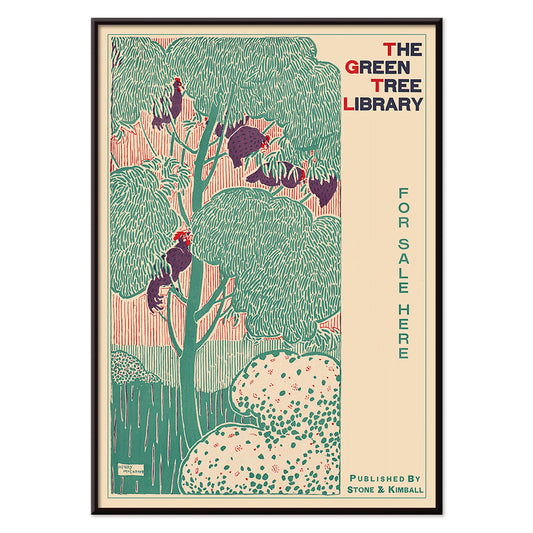
The green tree library Poster
Henry McCarter · 1890 · Decorative library poster featuring a stylized green tree and bold Art Nouveau lettering
Poster from £9 · Framed from £16
Regular price From £6.00Regular price -
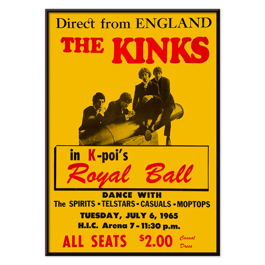
The Kinks at Honolulu Poster
Unknown artist · 1965 · Bold red and yellow concert poster for The Kinks live in Honolulu
Poster from £9 · Framed from £16
Regular price From £6.00Regular price -
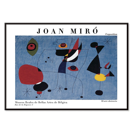
Woman and Bird at Night Poster
Joan Miro · 1947 · Playful surrealist poster with midnight blue field and bright red and yellow signs
Poster from £9 · Framed from £16
Regular price From £6.00Regular price -
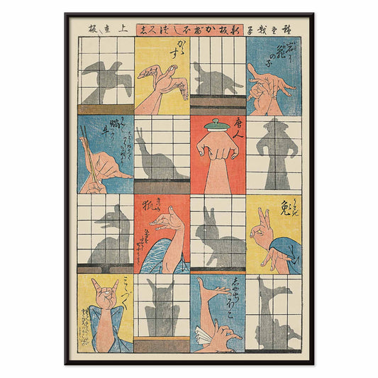
Eight shadow figures Poster
Utagawa Hiroshige · 1842 · Playful ukiyo-e poster of hand shadows and paper screens
Poster from £9 · Framed from £16
Regular price From £6.00Regular price -
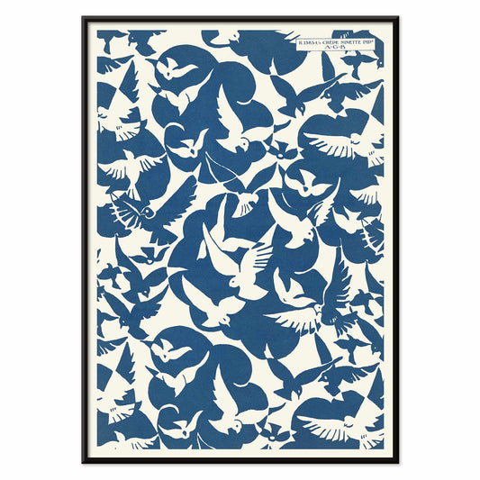
Lesbesse crépe Poster
Charles Goy · 1928 · Minimalist bird poster with blue silhouettes on a cream advertising field
Poster from £9 · Framed from £16
Regular price From £6.00Regular price -
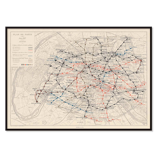
Plan de Paris et du chemin de fer métropolitain Poster
Louis Wuhrer · 1912 · Paris Metro poster with finely drawn routes and a historic city map
Poster from £9 · Framed from £16
Regular price From £6.00Regular price -
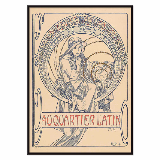
Au Quartier Latin Poster
Alphonse Mucha · 1900 · Art Nouveau poster with a poised figure and ornate circular framing
Poster from £9 · Framed from £16
Regular price From £6.00Regular price -
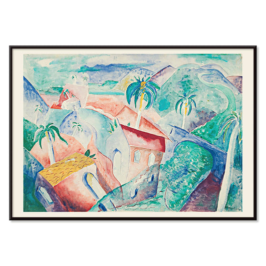
Cuban Landscape Poster
Paul Gaulois · 1926 · Sunlit Cuban landscape poster balancing lush greens, cobalt sky, and warm village tones
Poster from £9 · Framed from £16
Regular price From £6.00Regular price -
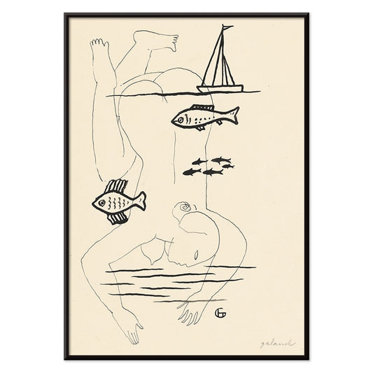
Drowned Poster
Mikuláš Galanda · 1930 · Surreal black-and-white poster merging human fragility with an aquatic fish motif
Poster from £9 · Framed from £16
Regular price From £6.00Regular price -
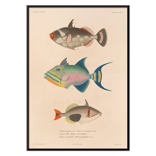
Voyage autour du monde 16 Poster
Louis-Isidore Duperrey · 1825 · Hand-colored fish scientific print with crisp linework and lively aquatic tones
Poster from £9 · Framed from £16
Regular price From £6.00Regular price -
Glute Muscles Poster
Reijer Jan Stolk · 1930 · Precise anatomical scientific print mapping glute muscles in crisp black line on beige
Poster from £9 · Framed from £16
Regular price From £6.00Regular price -
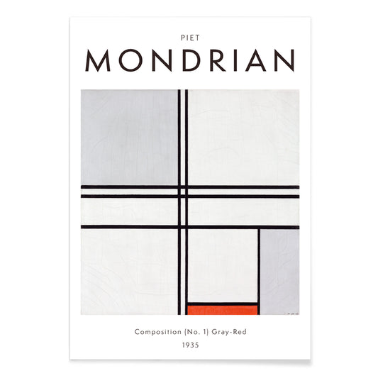
Composition (No. 1) Poster
Piet Mondrian · 1935 · Asymmetrical grid poster with black lines, grey fields, and one red block
Poster from £9 · Framed from £16
Regular price From £6.00Regular price -
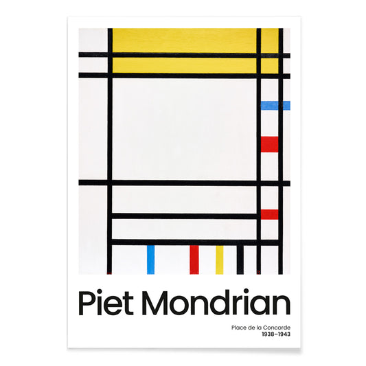
Place de la Concorde Poster
Piet Mondrian · 1941 · Geometric abstract poster balancing a black grid with red, yellow, and blue planes
Poster from £9 · Framed from £16
Regular price From £6.00Regular price -
Soyuz TMA-14M spacecraft Poster
NASA · 2015 · Dramatic Soyuz capsule poster descending under an orange parachute against a wide blue sky
Poster from £9 · Framed from £16
Regular price From £6.00Regular price -
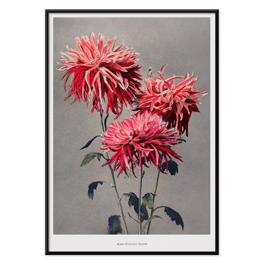
Asa–dsuma–bune Poster
Kazumasa Ogawa · 1896 · Hand-colored floral print featuring scarlet blossoms and crisp leaves against a quiet ground
Poster from £9 · Framed from £16
Regular price From £6.00Regular price -
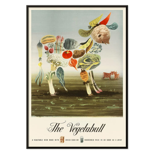
The Vegetabull Poster
Lewitt-Him · 1933 · Whimsical vegetable bull poster with bold, playful shapes and cheerful market-day energy
Poster from £9 · Framed from £16
Regular price From £6.00Regular price -
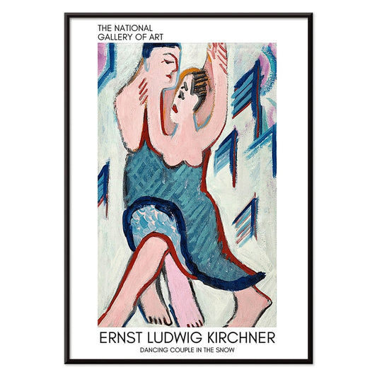
Dancing couple in the snow Poster
Ernst Ludwig Kirchner · 1928 · Expressionist art print of a dancing couple in a vivid snowy landscape
Poster from £9 · Framed from £16
Regular price From £6.00Regular price -
Eat fruit - be healthy Poster
Work Projects Administration · 1936 · Vintage poster with bold lettering and fruit forms in a healthy message
Poster from £9 · Framed from £16
Regular price From £6.00Regular price -
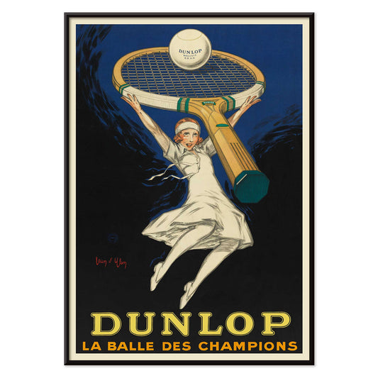
Dunlop, the ball of champions Poster
Jean d Ylen · 1929 · Dynamic Dunlop poster with a tennis player beneath an oversized racket
Poster from £9 · Framed from £16
Regular price From £6.00Regular price -
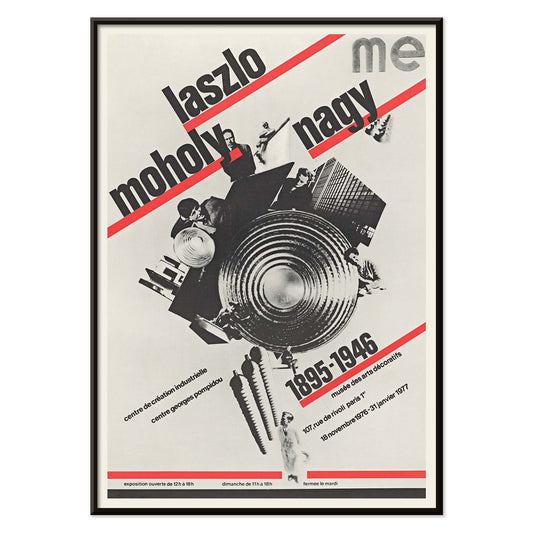
László Moholy-Nagy poster Poster
Roman Cieślewicz · 1976 · Bauhaus poster with bold diagonal typography and a black collage core
Poster from £9 · Framed from £16
Regular price From £6.00Regular price -
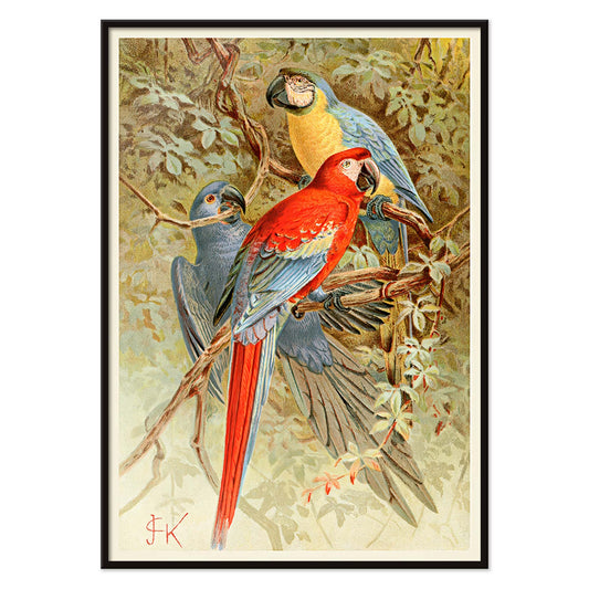
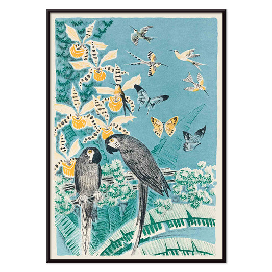
Macaws Poster
Unknown artist · 1893 · Vivid macaws print with lush rainforest foliage and crisp natural history detail
Poster from £9 · Framed from £16
Regular price From £6.00Regular price -
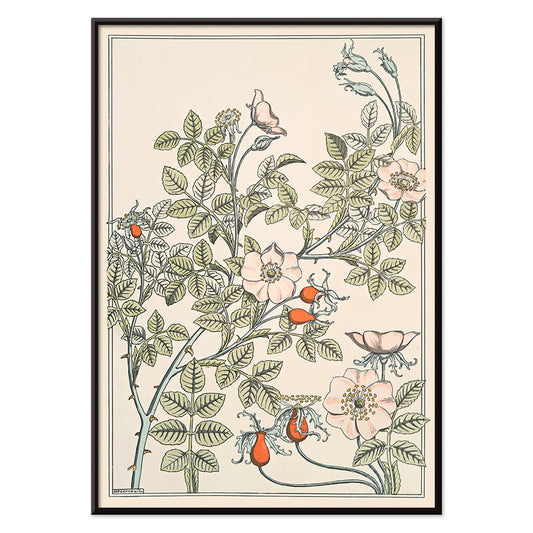
Eglantier Poster
Maurice Pillard Verneuil · 1896 · Graceful wild rose art print with flowing stems, leaves, and delicate blossoms
Poster from £9 · Framed from £16
Regular price From £6.00Regular price -
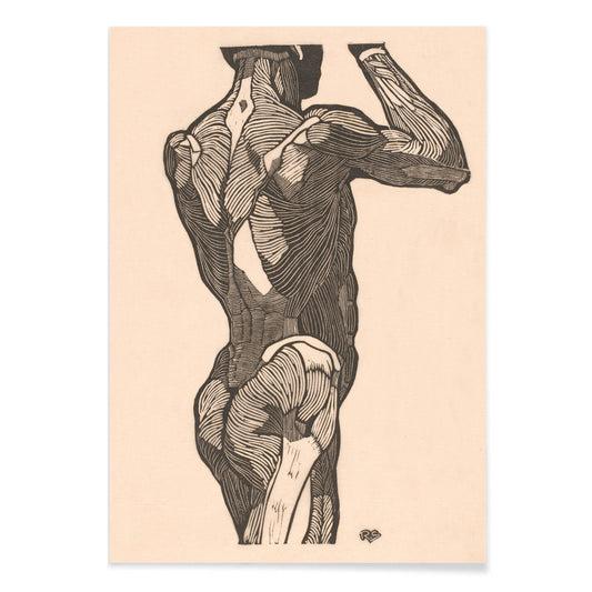
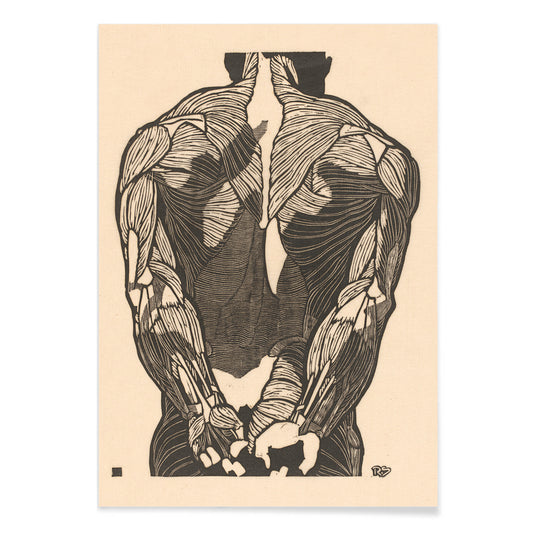
Back Muscles 2 Poster
Reijer Stolk · 1932 · Precise anatomical scientific print mapping back muscles in crisp black line on beige
Poster from £9 · Framed from £16
Regular price From £6.00Regular price -
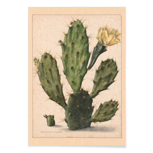
Pear Cactus in Bloom Poster
Herman Saftleven the Younger · 1650 · Pear cactus print with segmented green pads and a delicate yellow flower
Poster from £9 · Framed from £16
Regular price From £6.00Regular price -
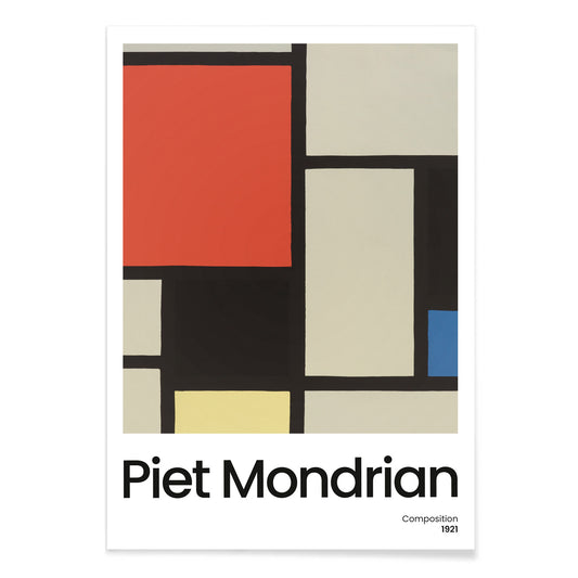
Composition with Large Red Plane Poster
Pieter Cornelis Mondriaan · 1921 · Geometric abstract art print with a large red plane and crisp black grid
Poster from £9 · Framed from £16
Regular price From £6.00Regular price -
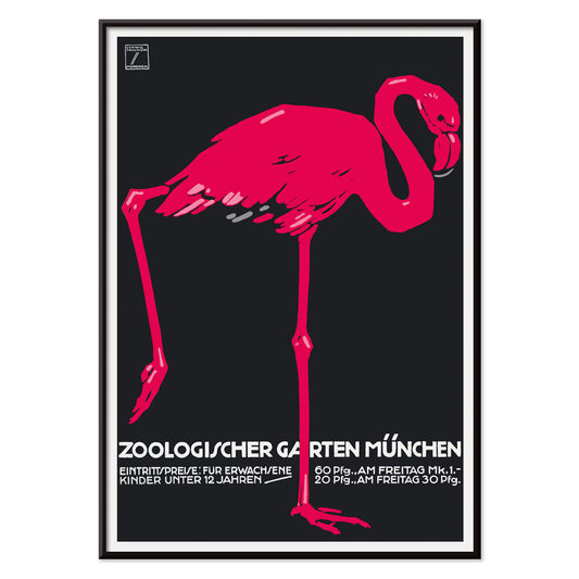
Zoologischer Garten München 2 Poster
Ludwig Hohlwein · 1930 · Graphic flamingo poster with bold black ground and vivid pink silhouette
Poster from £9 · Framed from £16
Regular price From £6.00Regular price -
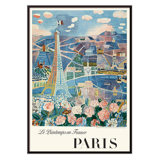
Le Printemps en France Poster
Raoul Dufy · 1925 · Joyful Eiffel Tower poster with airy springtime lines and bright Paris energy
Poster from £9 · Framed from £16
Regular price From £6.00Regular price -
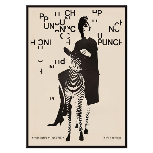
Punch Boutique Poster
Paul Mitzkat · 1950 · Witty black and beige poster featuring an elegant woman beside a zebra
Poster from £9 · Framed from £16
Regular price From £6.00Regular price -
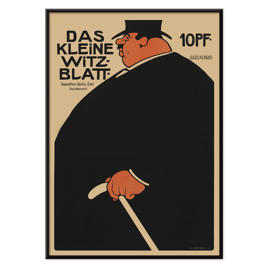
Das kleine Witzblatt Poster
Julius Klinger · 1901 · Advertising poster as a bold vintage print in black and orange
Poster from £9 · Framed from £16
Regular price From £6.00Regular price -
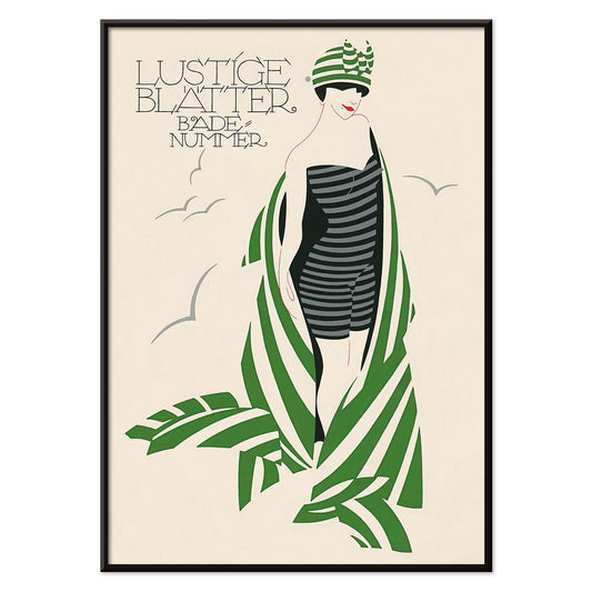
Lustige Blatter Badenummer Poster
Julius Klinger · 1911 · Striped swimsuit poster with Art Nouveau leaves and bathing-number lettering
Poster from £9 · Framed from £16
Regular price From £6.00Regular price -
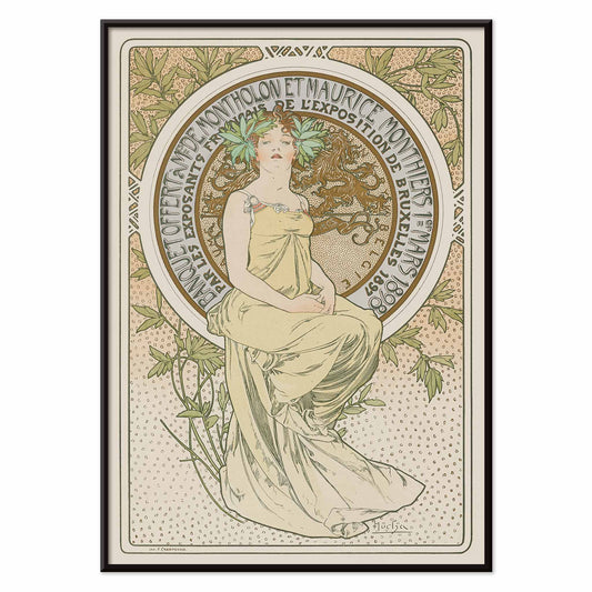
Exposition de Bruxelles Poster
Alphonse Mucha · 1897 · Art Nouveau poster for Exposition de Bruxelles with a seated figure
Poster from £9 · Framed from £16
Regular price From £6.00Regular price -
Douze contes Poster
José-Maria de Heredia · 1879 · Whimsical birds and butterflies poster framing a French tale title in lush foliage
Poster from £9 · Framed from £16
Regular price From £6.00Regular price -
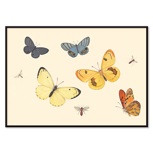
Five Butterflies Poster
Pieter Withoos · 1675 · Delicate insect print featuring five butterflies, a wasp, and two flies on pale ground
Poster from £9 · Framed from £16
Regular price From £6.00Regular price -
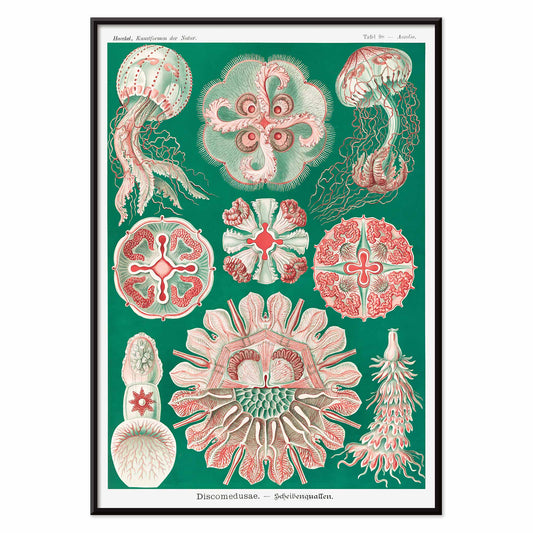
Discomedusae Poster
Ernst Haeckel · 1904 · Detailed jellyfish scientific print with floating bells and lace-like tentacles
Poster from £9 · Framed from £16
Regular price From £6.00Regular price -
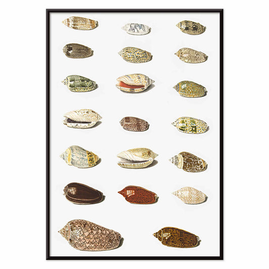
Twenty Tropical Shells Poster
Johann Gustav Hoch · 1750 · Detailed tropical shells print arranged like a collector plate on clean white ground
Poster from £9 · Framed from £16
Regular price From £6.00Regular price -
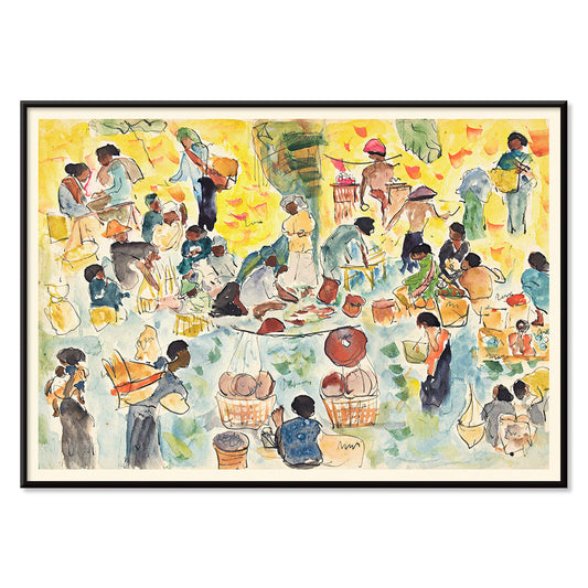
Market scene in the Dutch East Indies Poster
Pierre Jean Apol · 1912 · Sunlit tropical market art print with bustling figures and vivid street color
Poster from £9 · Framed from £16
Regular price From £6.00Regular price -
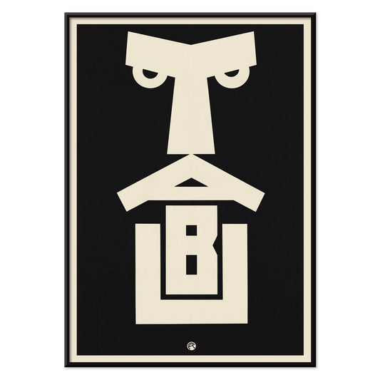
Tabu Poster
Julius Klinger · 1919 · Bold Tabu poster rendered as a striking vertical poster
Poster from £9 · Framed from £16
Regular price From £6.00Regular price -
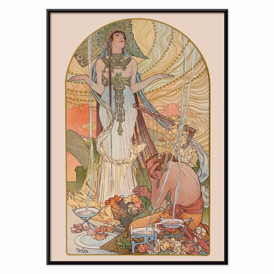
Salammbô: The Incantation Poster
Alphonse Mucha · 1897 · Art Nouveau poster of Salammbô in a vertical ritual scene
Poster from £9 · Framed from £16
Regular price From £6.00Regular price -
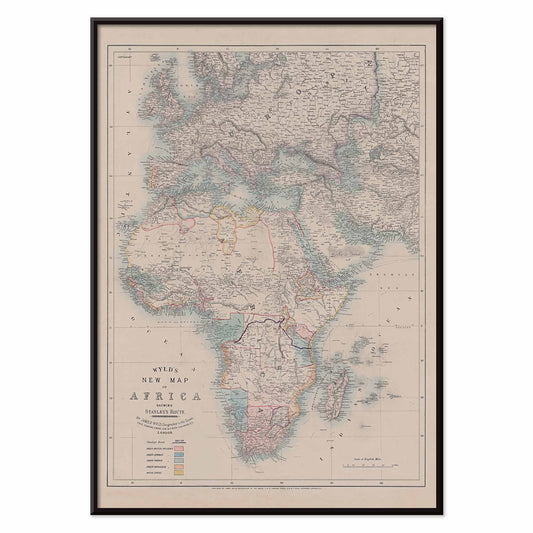
New map of Africa Poster
Wyld · 1887 · Vintage poster map in muted tones with detailed African coastlines
Poster from £9 · Framed from £16
Regular price From £6.00Regular price -
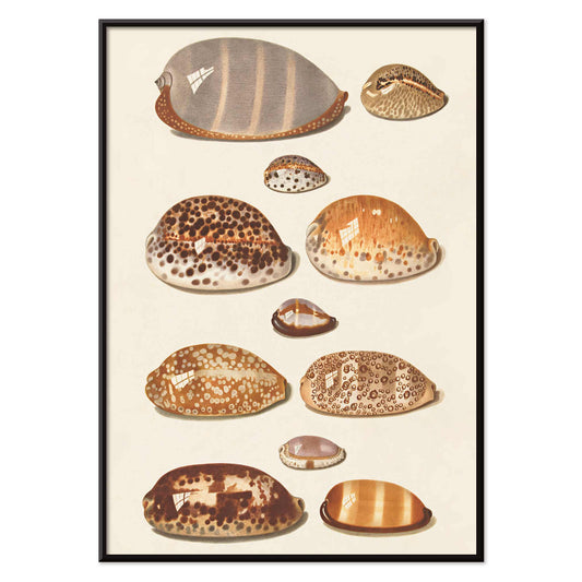
Tropical shells Poster
Johann Gustav Hochbrucker · 1837 · Detailed shell print presenting eleven tropical specimens in calm beige and umber tones
Poster from £9 · Framed from £16
Regular price From £6.00Regular price -
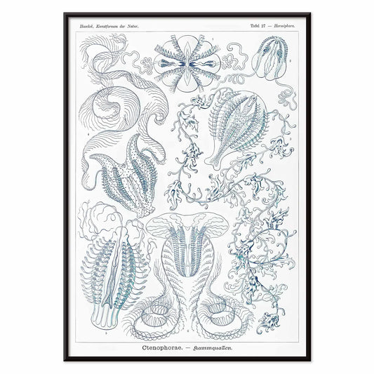
Ctenophorae Poster
Ernst Haeckel · 1904 · Ethereal comb jellies scientific print with delicate blue translucence and precise zoological detail
Poster from £9 · Framed from £16
Regular price From £6.00Regular price -
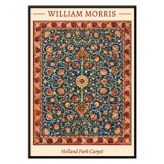
Holland Park Carpet Poster
William Morris · 1856 · Ornamental floral poster featuring rhythmic vines and medallion blooms in blue and red
Poster from £9 · Framed from £16
Regular price From £6.00Regular price -
Three Acrobats Poster
Arthur Bowen Davies · 1920 · Lithe circus figures in a black and white art print with rhythmic modernist line
Poster from £9 · Framed from £16
Regular price From £6.00Regular price -
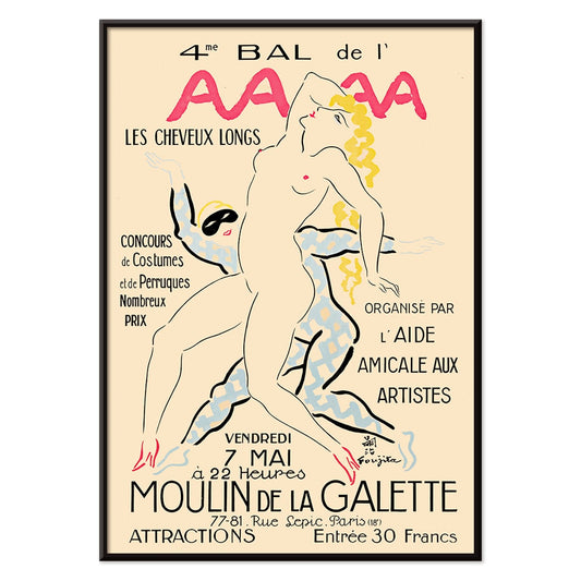
4eme Bal de l'AAAA Poster
Foujita · 1926 · Elegant Montmartre ball poster with crisp linework and soft pink yellow blue accents
Poster from £9 · Framed from £16
Regular price From £6.00Regular price -
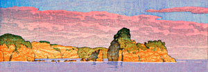
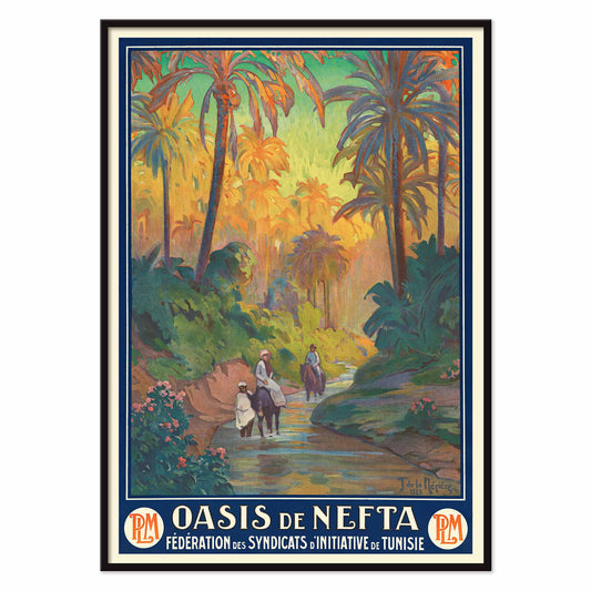
Oasis de Nefta Poster
Joseph de La Nézière · 1925 · Oasis de Nefta appears as a vintage poster with palms beside a stream
Poster from £9 · Framed from £16
Regular price From £6.00Regular price -
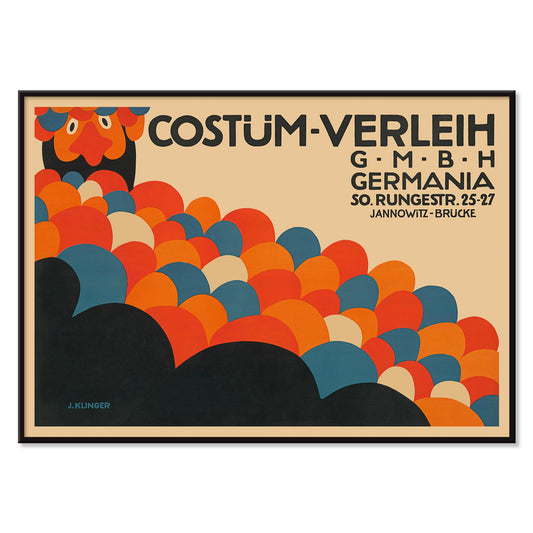
Costüm-Verleih Germania Poster
Julius Klinger · 1909 · Costume rental poster with bold abstract circles and Berlin lettering
Poster from £9 · Framed from £16
Regular price From £6.00Regular price -
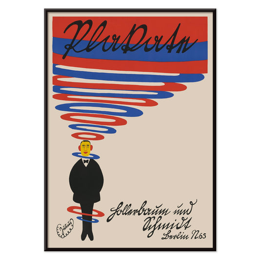
Hollerbaum und Schmidt Poster
Julius Klinger · 1910 · Spiraling advertising poster with a small suited figure and bold red-blue bands
Poster from £9 · Framed from £16
Regular price From £6.00Regular price -
Shadow Hands Poster
George Lodewijk Funke · 1879 · Playful hand-shadow vintage print presenting puppet shapes in crisp black silhouettes
Poster from £9 · Framed from £16
Regular price From £6.00Regular price


58/202 items
- The Equatorial Jungle Poster
- Woman Walking in an Exotic Forest Poster
- Composition in White, Red, and Yellow Poster
- Area Broken by Perpendiculars Poster
- Plaster Hand Poster
- The green tree library Poster
- The Kinks at Honolulu Poster
- Woman and Bird at Night Poster
- Glute Muscles Poster
- Composition (No. 1) Poster
- Place de la Concorde Poster
- Soyuz TMA-14M spacecraft Poster
- Asa–dsuma–bune Poster
- The Vegetabull Poster
- Dancing couple in the snow Poster
- Back Muscles 2 Poster
- Pear Cactus in Bloom Poster
- Composition with Large Red Plane Poster
- Zoologischer Garten München 2 Poster
- Le Printemps en France Poster
- Punch Boutique Poster
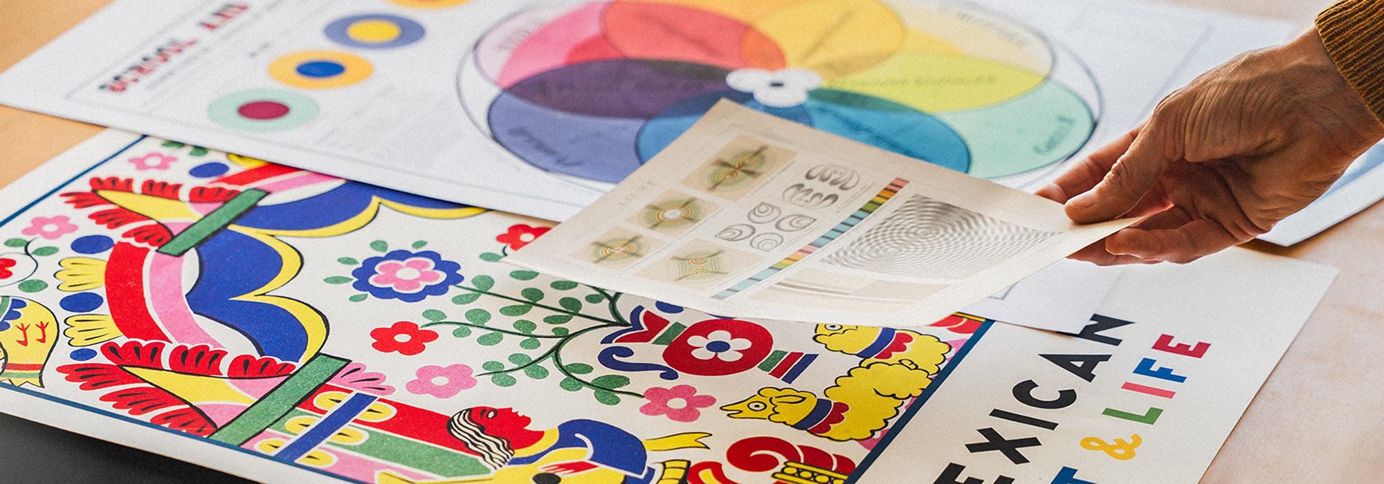
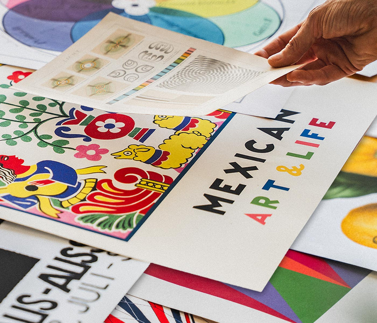
A curator-led cross section of poster culture
Our Selection gathers the kind of images that once lived on street corners, in shop windows, and on gallery walls, then learned how to behave in a home. It is not a single movement but a conversation between vintage poster design, modern art print sensibilities, and documentary photography. The common thread is legibility and atmosphere: work that reads clearly from a distance, then rewards a closer look with paper grain, ink edges, and deliberate restraint. For a broader overview of formats and eras, the main All Posters index helps place this edit in context.
Design history in miniature, from lithography to the photo screen
Classic posters were engineered for attention, which is why their compositions tend to be decisive: simplified shapes, high contrast, and typography that can hold its own against city noise. Many of the most memorable examples relied on lithography, where separate colour stones built flat fields that still feel fresh today. Later processes introduced halftone dots and photographic grain, adding a different kind of texture and realism. If you gravitate toward structure and reduced form, the language of abstract graphics often sits nearby; for an image with a quieter, observational pull, Photo offers a related sensibility. A more nervous, handwritten line can be found through Egon Schiele, where drawing becomes psychology as much as depiction.
Interior placement: how to use a varied edit room by room
Because the selection spans several visual registers, it works best when the room sets the volume. In living spaces with oak, linen, or boucle, choose a vintage poster with softened pigments or warm paper tones so the wall art feels integrated rather than loud. Hallways benefit from vertical emphasis and repeated intervals, which is where Vertical Posters can help establish rhythm. In kitchens and dining corners, sharper typography and botanical detail tend to feel natural; pairing with Botanical keeps the palette grounded in greens and off-whites. For bedrooms, lean toward lower contrast prints and calmer spacing, or move into the tonal discipline of Black & White to keep the light gentle.
Curating a gallery wall without forcing harmony
Good decoration relies on pacing: one assertive image, several quieter ones, and a repeated cue that ties the set together, such as a single ink colour or shared margin width. A practical approach is to anchor the group with a typographic or emblematic sheet, then add a photograph or landscape fragment as a softer counterweight. When you want a stronger graphic note, borrow a companion from Advertising; when you want slower, museum-like cadence, echo it with a piece from Classic Art. Frame choice does the final editing: pale wood lifts warm palettes, black metal sharpens linework, and a generous mount makes aged paper feel intentional. A simple route is to keep frames consistent while letting imagery vary, then adjust spacing until the negative space becomes part of the composition.
An edit that can evolve with your rooms
The strength of Our Selection is its openness: it behaves like a personal archive, ready to be re-sequenced as furniture shifts and colour choices mature. Some homes keep the mix eclectic; others gradually steer it toward a decade, a subject, or a single dominant hue. Either way, the poster and print languages here were made to coexist, and the most convincing gallery walls are the ones that look accumulated rather than planned.