


You may also like
-
Farbstudien, 10 Blätter I Poster
Karl Wiener · 1923 · Energetic abstract poster balancing orange and green forms on warm beige
Poster from £9 · Framed from £16
Regular price From £6.00Regular price -
Farbstudien, 10 Blätter IV Poster
Karl Wiener · 1923 · Luminous abstract watercolor art print with layered color fields in blue, purple, and yellow
Poster from £9 · Framed from £16
Regular price From £6.00Regular price -
Farbstudien, 10 Blätter IX Poster
Karl Wiener · 1923 · Abstract watercolor art print balancing green and violet washes with quiet modernist rhythm
Poster from £9 · Framed from £16
Regular price From £6.00Regular price -
Farbstudien, 10 Blätter X Poster
Karl Wiener · 1923 · Modernist abstract art print featuring geometric shapes in muted blue, ochre, and black
Poster from £9 · Framed from £16
Regular price From £6.00Regular price


-

"Very nice Posters. The quality is amazing and we received it very quickly !"
-

"A shop to visit absolutely. Huge selection of posters. We spent more than an hour there !"
-

"Perfect to find gift. Price are very good. An they can frame and pack it on site"


About the Artist
Karl Wiener was an Austrian painter and graphic artist active in Vienna during the interwar period, a time when European modernism was reshaping artistic expression. His work bridged the gap between fine art experimentation and the clarity of graphic design, resulting in pieces that feel both innovative and thoughtfully composed.
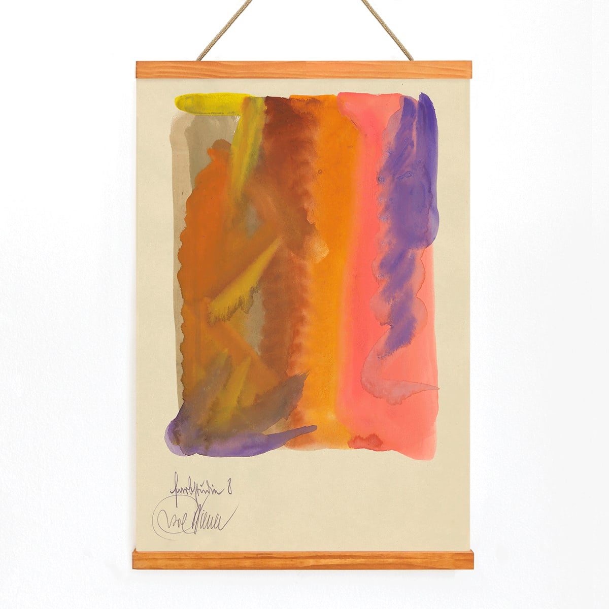
Farbstudien, 10 Blätter VIII exemplifies Wiener’s dedication to visual research and abstraction. Created in 1923, this series reflects the spirit of inquiry that defined the era, as artists sought new ways to convey emotion and perception without relying on traditional subjects or narratives.
The Artwork
Farbstudien, meaning color studies, is part of a larger suite exploring the relationships between hue, contrast, and visual rhythm. In the early 1920s, artists across Central Europe were developing abstract approaches to capture the essence of modern life. This work stands as a testament to that movement, prioritizing sensation and mood over representation.
Rather than illustrating a specific scene, the piece invites viewers to experience color and form as the main subjects. It embodies the experimental energy of the interwar years, when abstraction was shaping the future of both fine and decorative arts. For more on this period, see our abstract wall art and Bauhaus posters collections.
Style & Characteristics
This abstract composition features flowing watercolor forms with soft, translucent edges that suggest organic movement. The palette is dominated by warm yellows, radiant pinks, and deep purples, set against a pale, airy background that provides a sense of openness and lightness.
The interplay of vibrant washes and gentle gradients creates a harmonious balance between spontaneity and control. The overall effect is calm yet dynamic, making it especially appealing to admirers of expressive modernism. Explore more works in this style in our minimalist and abstract selections.
In Interior Design
This fine art print serves as a striking focal point in contemporary interiors, whether above a sofa, sideboard, or in a reading nook. Its warm tones complement neutral palettes such as beige, stone, and natural wood, while the purples introduce subtle depth alongside darker accents or metallic finishes.
Ideal for modernist and design-forward spaces, this piece pairs beautifully with clean lines and curated color schemes. For a refined presentation, consider framing it with a light wood or off-white mount from our frames collection.