


You may also like
-
Le Lac d’Annecy Poster
Frederic Hugo d Alesi · 1900 · Serene Lake Annecy travel poster with sunset light, mountains, and reflective water
Poster from £9 · Framed from £16
Regular price From £6.00Regular price -
Lac d’Annecy 2 Poster
François-Charles Cachoud · 1902 · Serene lake poster with a solitary boat and soft Alpine twilight hues
Poster from £9 · Framed from £16
Regular price From £6.00Regular price -
Crans Poster
Unknown artist · 1955 · Dynamic alpine ski poster with bold color blocks, crisp slopes, and blue sky
Poster from £9 · Framed from £16
Regular price From £6.00Regular price -
Bex Brine Baths Poster
Aime-Felix Nicollerat · 1896 · Alpine spa resort poster with stone bridge, rushing river, and radiant mountain peaks
Poster from £9 · Framed from £16
Regular price From £6.00Regular price


-

"Very nice Posters. The quality is amazing and we received it very quickly !"
-

"A shop to visit absolutely. Huge selection of posters. We spent more than an hour there !"
-

"Perfect to find gift. Price are very good. An they can frame and pack it on site"


About the Artist
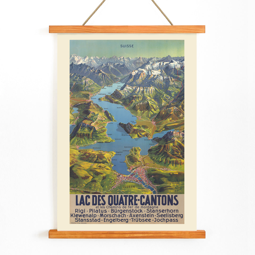
M. Bieder is credited as the creator of this 1935 Swiss map poster, produced during a period when graphic design and cartography were closely intertwined in Central Europe. Although little is known about Bieder’s biography, the artist’s work reflects a tradition of precision and clarity in Swiss mapmaking, where visual appeal and navigational function were equally valued.
In the early twentieth century, such posters were essential tools for both local travelers and international visitors, helping to shape Switzerland’s image as a destination of natural beauty and adventure. Today, Bieder’s map stands as a testament to the era’s blend of artistry and practicality, and is sought after by collectors of vintage cartographic prints.
The Artwork
Lac Des Quatre-Cantons, or Lake Lucerne, is depicted here as more than a body of water—it becomes a symbol of Swiss identity and leisure. Created at a time when railways and steamers opened up the Alps to tourism, this map poster functioned as both a guide and an invitation, encouraging exploration of the region’s storied landscapes and historic towns.
The poster’s narrative is one of movement and discovery, reflecting a broader cultural enthusiasm for travel and outdoor recreation in 1930s Switzerland. For those interested in vintage map wall art, it offers a window into the ways geography and design intersected to inspire wanderlust.
Style & Characteristics
The composition is dominated by the branching blue expanse of Lake Lucerne, surrounded by stylized green and brown landforms that evoke the region’s mountainous terrain. White accents highlight peaks and ridges, suggesting crisp alpine elevations, while the relief-like shading adds depth and clarity.
Place names and routes are carefully integrated with elegant typography, maintaining both legibility and decorative appeal. The overall effect is fresh and inviting, ideal for those drawn to blue-toned wall decor and classic Swiss landscape aesthetics.
In Interior Design
This vintage map poster lends a cultured, adventurous spirit to living rooms, offices, or hallways, especially in interiors that favor natural materials like wood and linen. Its cool palette and graphic clarity work well in Scandinavian, modern, or alpine-inspired spaces.
Pair it with muted greens, warm browns, and soft whites, or let it stand out against neutral walls. It also complements landscape art prints and understated frames for a cohesive, travel-inspired display.