


You may also like
-
Eat fruit - be healthy Poster
Work Projects Administration · 1936 · Vintage poster with bold lettering and fruit forms in a healthy message
Poster from £9 · Framed from £16
Regular price From £6.00Regular price -
Eat Greens for Health Poster
Hans Schleger · 1943 · Modernist nutrition poster with bold greens and crisp wartime typography
Poster from £9 · Framed from £16
Regular price From £6.00Regular price -
Dig for Plenty Poster
Mary Le Bon · 1942 · Uplifting wartime poster featuring a colorful harvest of vegetables and bold lettering
Poster from £9 · Framed from £16
Regular price From £6.00Regular price -
The Vegetabull Poster
Lewitt-Him · 1933 · Whimsical vegetable bull poster with bold, playful shapes and cheerful market-day energy
Poster from £9 · Framed from £16
Regular price From £6.00Regular price


-

"Very nice Posters. The quality is amazing and we received it very quickly !"
-

"A shop to visit absolutely. Huge selection of posters. We spent more than an hour there !"
-

"Perfect to find gift. Price are very good. An they can frame and pack it on site"


About the Artist
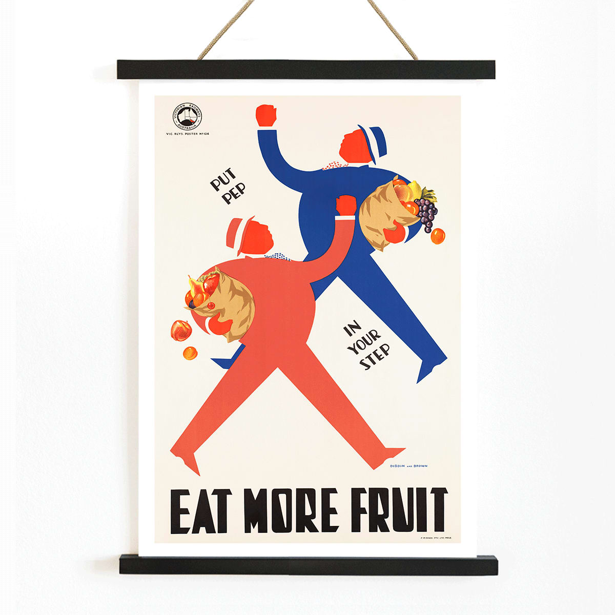
Created by an anonymous artist, this 1950 poster reflects the collaborative spirit of mid-century public health campaigns. During this era, designers, illustrators, and civic institutions joined forces to create impactful graphics that could reach broad audiences in everyday settings. Such works were often unsigned, emphasizing the collective effort behind public messaging rather than individual authorship.
Anonymous poster design played a vital role in shaping visual culture, especially in the context of health and nutrition education. Eat more fruits stands as an example of how graphic design was harnessed to encourage positive habits, making it a valuable piece of social history as well as a collectible vintage print.
The Artwork
Eat more fruits was conceived as a persuasive tool to promote healthy eating, particularly in the years following World War II when nutrition became a public priority. The poster was likely displayed in markets, schools, and community spaces, aiming to inspire families and individuals to make better dietary choices. Its message aligns with broader efforts to improve public well-being through accessible, visually engaging communication.
For those interested in vintage advertising posters, this piece offers insight into how design and messaging intersected to shape everyday behavior. It captures a moment when visual clarity and optimism were key to effective public information.
Style & Characteristics
The poster features stylized figures of shoppers carrying overflowing baskets of fruit, rendered with simplified forms for maximum clarity. The composition is dominated by bold, flat areas of red, blue, and black, creating strong visual contrast and immediate impact. Large, assertive lettering ensures the slogan is easily readable, while the friendly illustration style keeps the tone approachable.
The overall effect is cheerful and energetic, with clean lines and a lively rhythm that draw the viewer’s eye. The use of primary colors and minimal detail reflects the mid-century graphic tradition, making this poster a striking example of its genre.
In Interior Design
This vintage poster is especially suited for kitchens, breakfast nooks, or dining areas, where its theme of fresh fruit and healthy living feels right at home. It can also bring a playful, uplifting touch to a family hallway or home office, adding color and positivity without overwhelming the space.
Pair it with white tiles, warm woods, or chrome accents for a classic mid-century look, or display it alongside other red accent prints, blue tone wall art, or vertical posters to create a cohesive gallery wall.