


You may also like
-
Eat Greens for Health Poster
Hans Schleger · 1943 · Modernist nutrition poster with bold greens and crisp wartime typography
Poster from £9 · Framed from £16
Regular price From £6.00Regular price -
Eat fruit - be healthy Poster
Work Projects Administration · 1936 · Vintage poster with bold lettering and fruit forms in a healthy message
Poster from £9 · Framed from £16
Regular price From £6.00Regular price -
Eat more fruits Poster
Unknown artist · 1950 · Cheerful public health poster with stylized shoppers and brimming fruit baskets
Poster from £9 · Framed from £16
Regular price From £6.00Regular price -
Don’t be a sucker Poster
Unknown artist · 1944 · Bold wartime poster featuring a fish and hook as a warning against manipulation
Poster from £9 · Framed from £16
Regular price From £6.00Regular price


-

"Very nice Posters. The quality is amazing and we received it very quickly !"
-

"A shop to visit absolutely. Huge selection of posters. We spent more than an hour there !"
-

"Perfect to find gift. Price are very good. An they can frame and pack it on site"


About the Artist
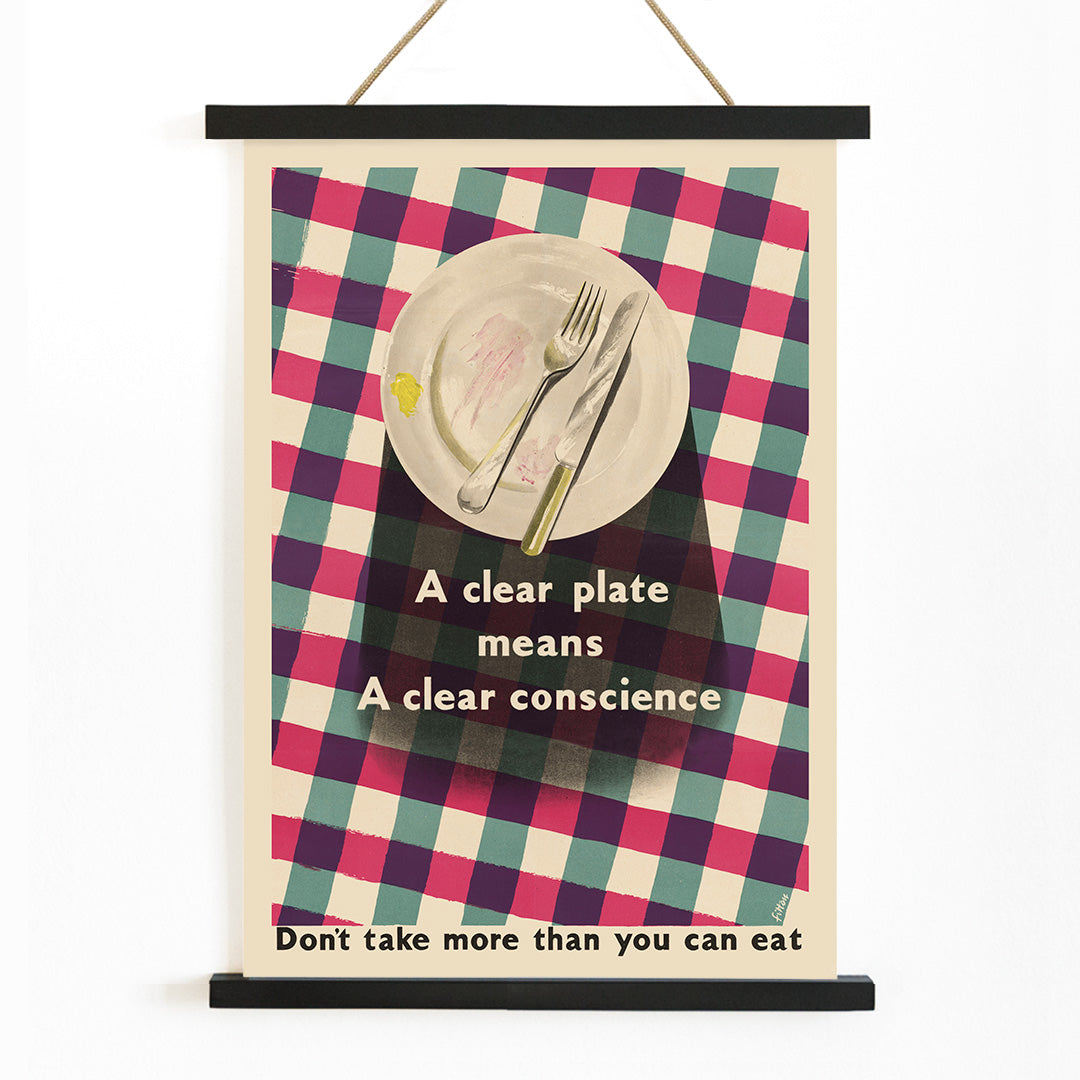
James Fitton was a British painter, illustrator, and poster designer whose career spanned much of the twentieth century. He became especially known for his contributions to public information campaigns, using his artistic skills to communicate important social messages in accessible ways. Fitton's work often bridged the gap between fine art and everyday life, making him a significant figure in British visual culture.
His posters and illustrations reflect a commitment to clarity and social responsibility, helping to shape the visual language of mid-century Britain. Fitton's legacy endures in the way he brought warmth and wit to subjects of public concern.
The Artwork
Created during a period marked by wartime and postwar austerity, Clear Plate exemplifies the British government's efforts to encourage citizens to reduce food waste. Posters like this were part of a broader campaign to promote frugality and mindful consumption, especially when rationing was a daily reality.
This artwork transforms a simple act—finishing one's meal—into a civic duty, linking personal habits to the greater good. It stands as a historical document of collective effort and practical morality, capturing the spirit of an era when everyday choices were imbued with national significance. For those interested in social history, it offers a window into the values and challenges of mid-century Britain.
Style & Characteristics
The poster features a strikingly simplified plate at its center, rendered with clean lines and flat areas of color. The design is dominated by crisp white, with bold accents of red and green that draw the eye and reinforce the message. Smaller touches of yellow and purple add vibrancy and visual interest.
Fitton’s use of strong contrast and minimal detail ensures immediate legibility, while the prominent typography delivers the message with authority. The overall effect is brisk, direct, and unmistakably mid-century, appealing to admirers of vintage advertising posters and kitchen prints alike.
In Interior Design
This vintage poster brings a sense of purpose and history to kitchens, dining areas, or communal spaces where food is shared. Its clean design pairs well with modern or retro interiors, especially those featuring enamelware, wood, or stainless steel.
To highlight its impact, consider displaying it alongside other white tone wall art or as part of a gallery wall with food-themed prints. Its message and palette can inspire thoughtful color choices, such as red or green accents, for a cohesive and inviting atmosphere.