


You may also like
-
Nihon chikurui zufu Pl.08 Poster
Yasuyoshi Shirasawa · 1912 · Serene bamboo print with fine linework and soft green washes on beige paper
Poster from £9 · Framed from £16
Regular price From £6.00Regular price -
Nihon chikurui zufu Pl.06 Poster
Yasuyoshi Shirasawa · 1912 · Refined bamboo botanical print with slender leaves and calm negative space
Poster from £9 · Framed from £16
Regular price From £6.00Regular price -
Bush cane Poster
Pierre-Joseph Redouté · 1805 · Graceful bush cane botanical print with slender leaves and delicate pale blooms
Poster from £9 · Framed from £16
Regular price From £6.00Regular price -
Collection of leaves Poster
Shirley Hibberd · 1855 · Delicate botanical print presenting varied leaf forms with fine veins on warm ivory paper
Poster from £9 · Framed from £16
Regular price From £6.00Regular price


-

"Very nice Posters. The quality is amazing and we received it very quickly !"
-

"A shop to visit absolutely. Huge selection of posters. We spent more than an hour there !"
-

"Perfect to find gift. Price are very good. An they can frame and pack it on site"


About the Artist
Yasuyoshi Shirasawa was a Japanese botanist and illustrator active in the early twentieth century, a time when botanical studies in Japan were becoming increasingly rigorous and visually refined. His work, including contributions to Nihon chikurui zufu, reflects a period when scientific illustration was essential for cataloguing native flora and supporting botanical research. Shirasawa's legacy lies in bridging scientific accuracy with artistic subtlety, making his prints valued by both scholars and art enthusiasts. His illustrations are now appreciated alongside other botanical works for their clarity and quiet elegance.
Shirasawa’s approach was rooted in the scholarly traditions of Japanese natural history, where each plate served both as a scientific document and as a testament to the beauty of observation. His careful renderings continue to inspire collectors interested in Japanese illustration and the intersection of art and science.
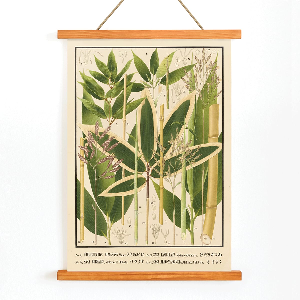
The Artwork
This plate from Nihon chikurui zufu, published in 1912, was created to document and compare bamboo varieties for botanists, gardeners, and forestry professionals. At a time when printed reference materials were vital to scientific communication, such illustrations helped standardize plant knowledge across Japan. Bamboo, depicted here, holds deep cultural significance as a symbol of resilience and adaptability, and its inclusion reflects both practical and symbolic interests of the era.
The artwork stands as a thoughtful record of botanical diversity, inviting viewers to appreciate not only the plant’s structure but also its role in Japanese culture and daily life. It exemplifies the dual purpose of scientific illustration: to inform and to inspire contemplation.
Style & Characteristics
The print is arranged as a classic scientific plate, featuring several bamboo specimens rendered with slender stalks and delicate leaves on a pale, cream-toned background. Japanese script labels provide identification, while the composition’s vertical flow evokes the natural growth of bamboo. The illustration employs precise outlines and subtle shading, ensuring clarity and legibility from any distance.
Shades of green dominate the palette, complemented by the warm beige of the paper and understated botanical accents. The overall mood is serene and orderly, making this a calming addition to a nature-inspired gallery wall or a collection of Japanese and Asian art.
In Interior Design
This bamboo botanical print brings a sense of calm and structure to living rooms, bedrooms, entryways, or home offices. Its gentle colors and balanced composition suit Japandi, minimalist, and Scandinavian interiors, as well as more traditional spaces that incorporate vintage prints and natural materials.
Pair it with green plants or textiles to echo its hues, and use wood, linen, or ceramic accents to enhance its warmth. Combine with other green-themed art or neutral pieces for a cohesive, tranquil interior that feels both fresh and timeless.