


You may also like
-
Red Lips Poster
Ikko Tanaka · 1972 · High-contrast poster featuring a stylized face and vivid red lips
Poster from £9 · Framed from £16
Regular price From £6.00Regular price -
Don’t be a sucker Poster
Unknown artist · 1944 · Bold wartime poster featuring a fish and hook as a warning against manipulation
Poster from £9 · Framed from £16
Regular price From £6.00Regular price -
Eat fruit - be healthy Poster
Work Projects Administration · 1936 · Vintage poster with bold lettering and fruit forms in a healthy message
Poster from £9 · Framed from £16
Regular price From £6.00Regular price -
Almanaque Poster
Sebastiao Rodrigues · 1960 · Abstract lion poster with bold orange and black geometry in a mid-century style
Poster from £9 · Framed from £16
Regular price From £6.00Regular price


-

"Very nice Posters. The quality is amazing and we received it very quickly !"
-

"A shop to visit absolutely. Huge selection of posters. We spent more than an hour there !"
-

"Perfect to find gift. Price are very good. An they can frame and pack it on site"


About the Artist
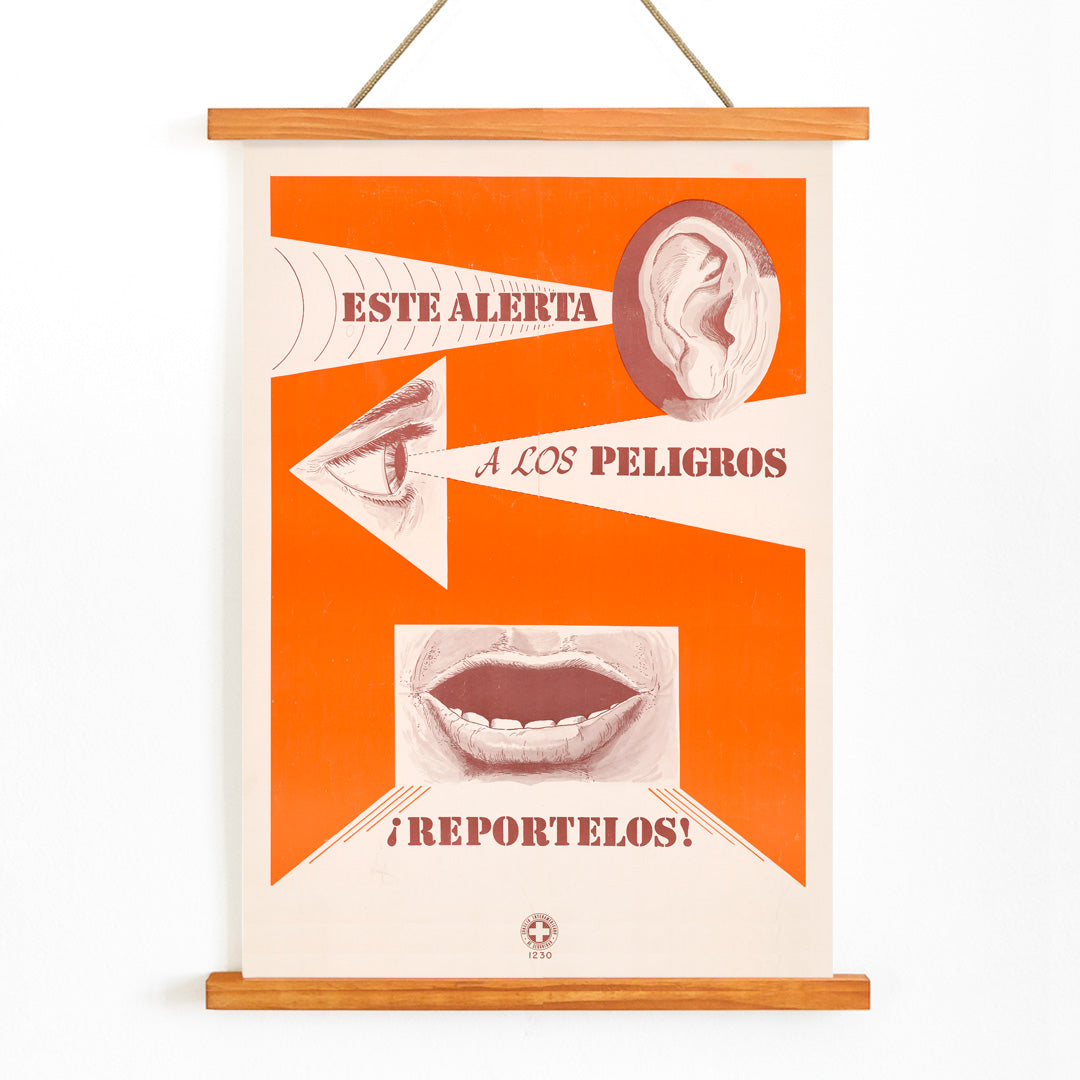
Created by an anonymous artist, this 1963 design is a product of the golden age of mid-century public information graphics. During this period, designers across Europe and beyond developed clear visual languages to communicate essential messages quickly and effectively. These posters were integral to factories, transport systems, and civic spaces, where conveying safety and instruction was paramount.
Reportelos exemplifies the era’s practical modernism, where image-led communication was prioritized for its immediacy and broad reach. As a vintage safety poster, it reflects the authority of official messaging, while its visual clarity and style have secured its place in the history of graphic design. Today, it stands as a testament to the enduring impact of mid-century visual culture, resonating with collectors of advertising posters and Bauhaus design.
The Artwork
This poster emerged at a time when workplace safety campaigns were expanding in response to increased mechanization and evolving public health standards. Such posters were designed for immediate recognition, encouraging viewers to adopt careful behaviors and reinforcing shared workplace rules.
The focus on the human senses—hearing, seeing, and speaking—serves as a reminder to stay alert and mindful in daily tasks. The original function of the piece was to prompt vigilance and responsibility, transforming it into a historical artifact that captures the spirit of mid-century safety culture. Its legacy is closely connected to the evolution of vintage advertising and graphic communication.
Style & Characteristics
The composition features bold, simplified icons of an ear, an eye, and a mouth, arranged with the clarity of a visual checklist. Dominated by vivid orange fields, the design is punctuated by crisp white forms and deep brown accents, creating strong contrast and immediate legibility.
The poster’s graphic economy reflects International Typographic Style influences, with a direct and energetic mood. The use of abstraction and minimal color palette gives it a timeless modernist appeal, making it a striking example of mid-century graphic design and a standout piece among orange wall art.
In Interior Design
This poster is particularly effective in spaces that benefit from both focus and creativity, such as home offices, studios, hallways, or kitchens. Its bold orange tones and graphic clarity make it a compelling focal point on white walls or when paired with natural materials like wood or concrete.
It pairs well with minimalist furniture and frames in black or natural finishes. For those curating a cohesive collection, it complements other minimalist wall decor and mid-century inspired designs, appealing to enthusiasts of graphic clarity and vintage poster art.