


You may also like
-
Antique map of Africa Poster
Institute of Liepzig · 1851 · Detailed Africa vintage print with gridded coordinates and dense place names
Poster from £9 · Framed from £16
Regular price From £6.00Regular price -
New map of Africa Poster
Wyld · 1887 · Vintage poster map in muted tones with detailed African coastlines
Poster from £9 · Framed from £16
Regular price From £6.00Regular price -
Antique map of Italy Poster
Institute of Liepzig · 1887 · Classic Italy map poster with crisp borders, islands, and dense geographic labeling
Poster from £9 · Framed from £16
Regular price From £6.00Regular price -
Antique map of Brasil Poster
Institute of Leipzig · 1886 · Detailed Brasil vintage print with crisp borders and period German typography
Poster from £9 · Framed from £16
Regular price From £6.00Regular price


-

"Very nice Posters. The quality is amazing and we received it very quickly !"
-

"A shop to visit absolutely. Huge selection of posters. We spent more than an hour there !"
-

"Perfect to find gift. Price are very good. An they can frame and pack it on site"


About the Artist
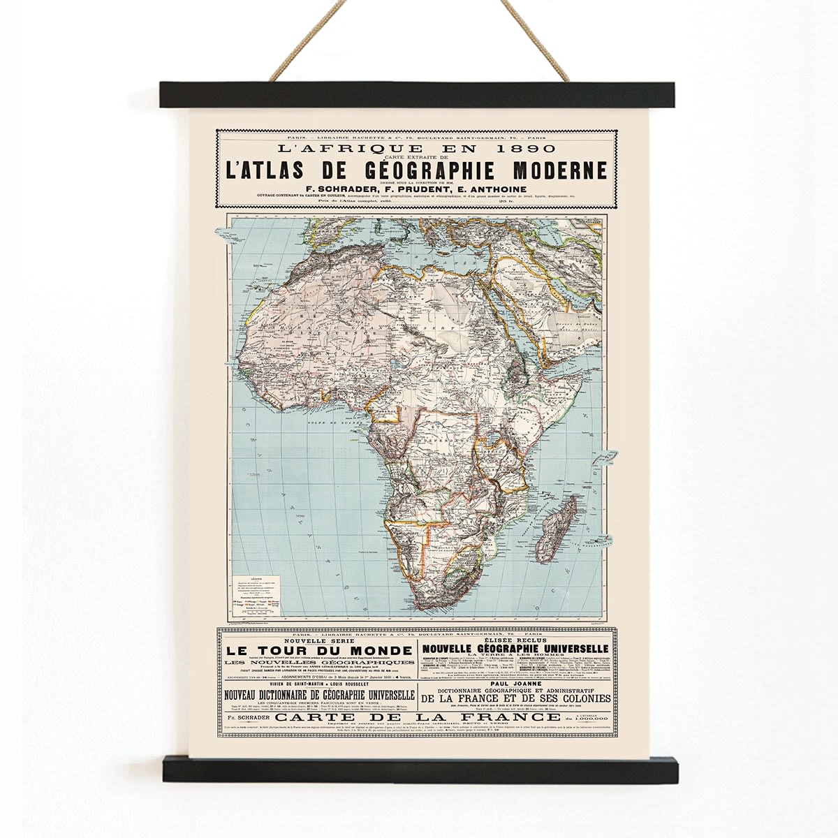
Created by an anonymous artist, this 1890 map exemplifies the collaborative nature of late nineteenth-century French cartography. During this period, maps were often produced by teams of geographers, engravers, and printers, with individual creators rarely credited. The primary aim was to provide clarity and authority, especially for educational and reference purposes, rather than to highlight personal authorship.
Such maps emerged at a time when scientific accuracy and visual accessibility were paramount. Today, these qualities make them appealing to collectors and enthusiasts who appreciate vintage cartographic works that reflect the historical context of their creation.
The Artwork
This map of Africa from 1890 captures the continent at a significant historical juncture, marked by the height of European colonial expansion and the drawing of new administrative boundaries. The map reflects the geopolitical realities and knowledge of the era, offering insight into how Africa was represented and understood in European atlases and classrooms.
Associated with the cartographic traditions of F. Schrader and Prudent Anthoine, this reference map was designed to communicate geography, resources, and governance in a clear and authoritative manner. It stands as a document of its time, prompting reflection on how maps have shaped perceptions of place and power.
Style & Characteristics
The map features a classic atlas composition, with Africa centrally positioned and surrounded by precise labels and measured grid lines. Fine linework and compact French typography contribute to its legibility, reinforcing its status as a historical document rather than a decorative piece.
The color palette includes a warm beige background, deep black ink for text and outlines, cool blue for surrounding waters, and selective orange accents that highlight key areas. The overall mood is studious and contemplative, appealing to those drawn to archival prints and vintage map posters.
In Interior Design
This vintage map is well suited for office walls, libraries, or entryways where a sense of history and narrative is desired. It pairs elegantly with materials like wood, leather, or brushed metal, and can serve as a focal point in both traditional and modern interiors.
For a cohesive look, combine it with other vintage map posters, or complement its tones with beige wall art and blue accents. It is ideal for travelers, history enthusiasts, and anyone curating a gallery wall with documentary appeal.