


- No bestsellers in this collection
-
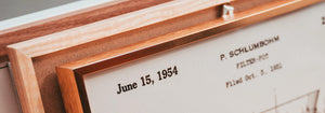
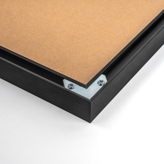
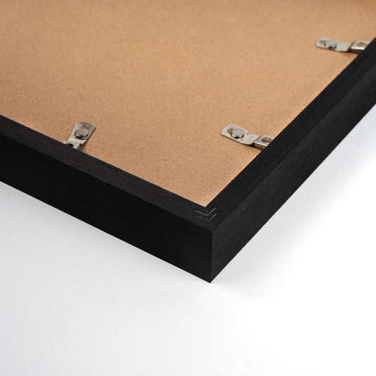
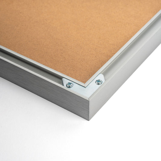
Black Aluminium Frame
This black aluminium frame brings a refined touch to any space, crafted from premium aluminium fo...
Poster from £13.50 · Framed from £24
Regular price From £9.00Regular price -
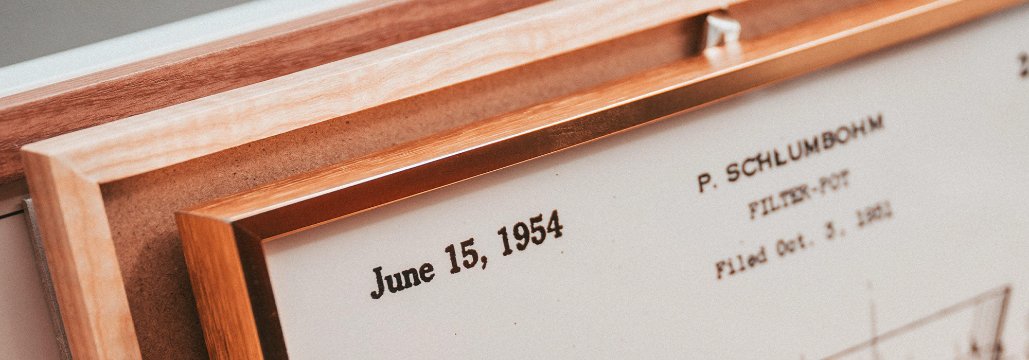
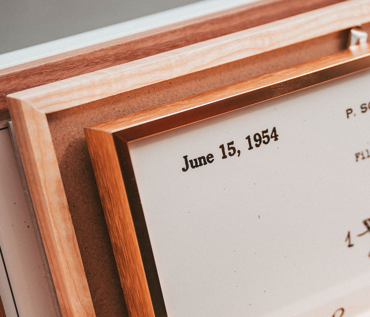
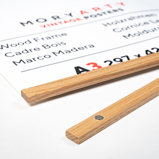
Light Pine Wood Frame
This classic frame is crafted from premium light pine wood, offering a timeless look that complem...
Poster from £13.50 · Framed from £24
Regular price From £9.00Regular price -
Black Pine Wood Frame
Elevate your space with this Black Pine Wood Classic Frame, crafted from premium wood for a refin...
Poster from £13.50 · Framed from £24
Regular price From £9.00Regular price -
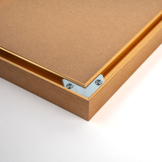
Golden Aluminium Frame
This classic frame features a golden aluminium finish, offering a refined touch to any space. Cra...
Poster from £13.50 · Framed from £24
Regular price From £9.00Regular price -
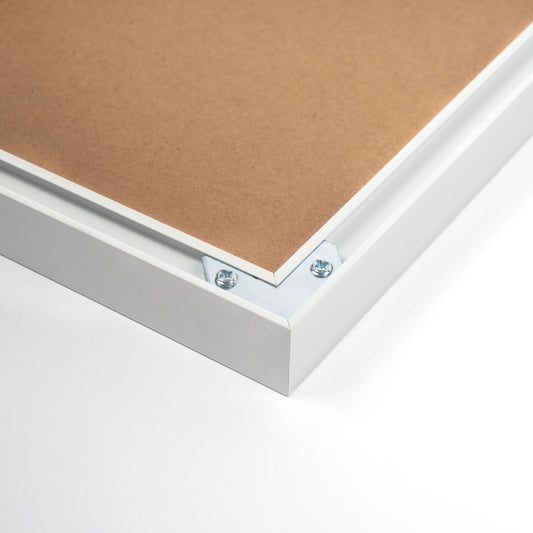
White Aluminium Frame
Discover the elegance of our White Aluminium Classic Frame, crafted from premium aluminium for a ...
Poster from £13.50 · Framed from £24
Regular price From £9.00Regular price -
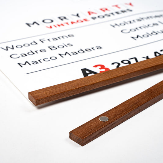
Light Oak Magnetic Wood Frame
Discover the elegance of our Light Oak Magnetic Wood Frame, crafted from premium wood for a refin...
Poster from £7.50 · Framed from £13.33
Regular price From £5.00Regular price -
Silver Aluminium Frame
This classic silver aluminium frame brings a refined touch to any space. Crafted from premium alu...
Poster from £13.50 · Framed from £24
Regular price From £9.00Regular price -
Light Pine Magnetic Wood Frame
Discover the Light Pine Magnetic Wood Frame, crafted from premium wood for a refined, natural loo...
Poster from £7.50 · Framed from £13.33
Regular price From £5.00Regular price -
Dark Oak Magnetic Wood Frame
Elevate your artwork or photos with this Dark Oak Magnetic Wood Frame. Crafted from premium wood,...
Poster from £7.50 · Framed from £13.33
Regular price From £5.00Regular price -
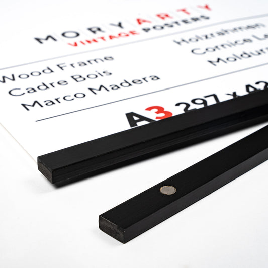
Black Pine Magnetic Wood Frame
Discover the Black Pine Magnetic Wood Frame, crafted from premium wood for a refined finish. This...
Poster from £7.50 · Framed from £13.33
Regular price From £5.00Regular price


- No bestsellers in this collection
Why framing changes the whole image
A poster can hold a century of design in a single sheet of paper, but it settles into a room once it gains an edge, a margin, a boundary. Frames act as that boundary: a small piece of architecture that turns a print into wall art and a wall into a setting. In homes shaped by vintage decoration, the frame is the transition between ink and plaster, between the mood of the artwork and the materials around it. The right perimeter also clarifies scale, making a modest print read with intention beside furniture and light.
From the print shop to the gallery wall
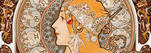
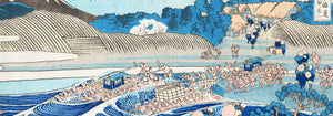
Historically, posters were designed for speed and distance: bold typography, simplified colour, and strong silhouettes that could compete with street noise. Once brought indoors, those same traits can feel abrupt without a controlled surround. The idea of a mount or margin has roots in printmaking and drawing practices, where the blank border protects the image and gives the eye a resting place. This is why a spare frame often suits graphic work from advertising design, while more delicate imagery, such as birds from Ohara Koson or night scenes from Kawase Hasui, benefits from a softer visual buffer and a quieter finish.
Profiles, finishes, and the way light behaves
The first decision is profile. Thin, contemporary lines emphasize the graphic intelligence of many vintage posters, while slightly deeper mouldings bring a steadier rhythm that reads as more traditional. Our framing options lean toward restraint because busy edges compete with a print’s typography or brushwork. A magnetic frame keeps the paper visible, close to the feel of a studio pin-up, and works well with uncoated stock and subtle palettes. A classic frame gives a crisp outline that holds its own across a room. Finishes matter, too: matte surfaces reduce glare and keep attention on tonal relationships, especially with black & white photography and line work.
Room-by-room framing choices that feel lived-in
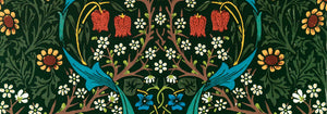
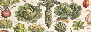
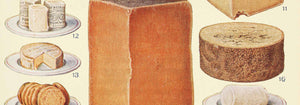
In living rooms, framing is often about anchoring a larger work above a sofa or console; tie the frame colour to existing materials, such as oak near warm woods or black near iron and leather. In bedrooms, quieter profiles support softer textiles and lower contrast palettes. In kitchens and dining corners, where visual bustle is part of daily life, a consistent frame finish helps a set of images read as one idea; herb studies and vintage plates from botanical prints look especially grounded in natural wood tones. If your home leans clean and architectural, borrow the discipline of minimalist wall art and keep profiles slim and repeated.
Curating proportions, spacing, and orientation
Good framing is also about spacing and proportion. Leave more air between pieces than instinct suggests so each art print can be read clearly and the wall does not turn into pattern. Mix sizes, but repeat one element, such as frame finish or mount width, to create coherence. If you are balancing formats, alternate portrait and landscape so the eye moves naturally; selecting by orientation from vertical posters and horizontal posters makes planning easier. Lay the arrangement on the floor first and watch for tangents where frames almost touch or align too neatly. A frame should feel like silence, not commentary, so the vintage poster can speak through colour, line, and history.