


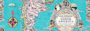


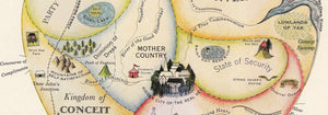


- Geographical Guide to a Woman's Heart Poster
- Save the whales Poster
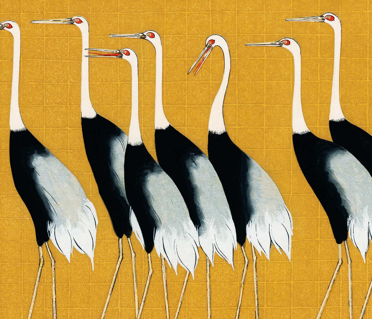
- Blue Japanese Crane Poster
- Beer and Cigarette Poster
- The Floor of the Oceans Poster
- The New Yorker Poster
- Zoologischer Garten Poster
- Snoopy come home Poster
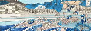
- Kanagawa Great Wave Poster
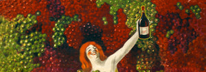
- Campari Soda Poster
- Black Cat 2 Poster
- Sigmund Freud had it Poster
- Wake up and read Poster
- Babar en Voiture Poster
- Grands Prix de France Poster
- Coffea Arabica 3 Poster
- Matisse Dancing Figures Poster
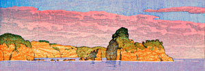
- Pink sky Poster
- Nu Bleu III Poster
- The Tricolor balloon Poster
- Le Voyage de Babar Poster
- Marihuana Poster
- The Dream Poster
- Panther Poster
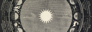
- Solaris Poster
- Cordial Campari Poster
- The Tiger of Ryōkoku Poster
- Papiers découpés 3 Poster
- Bleu de Ciel Poster
- Surfers in Venice Beach Poster
- Papiers découpés 1 Poster
- The Great Wave Poster
- Photographic camera patent Poster
- Loquats (Eriobotrya Japonica) Poster
- Nu Bleu II Poster
- Daybreak over Lake Yamanaka Poster
- Black Cat 4 Poster
- Drink Coca Cola Poster
- Bauhaus Poster 2 Poster
- Sitting cat, facing left Poster
- Star Wars AT-AT Patent Poster
- Bauhaus Poster 6 Poster
- Asakusa Kinryuzan Temple Poster
- Histoire de Babar Poster
- Sitting cat, from behind Poster
- Lemons (Citrus Limon) Poster
- Babar en famille Poster
- Black Leopard Poster
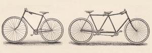
- Surfboard Patent Poster
- Mickey Mouse Poster
-
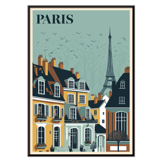
Travel to Paris Poster
MORYARTY · 1929 · Elegant Eiffel Tower poster above Paris rooftops glowing with sunset blues and yellows
Poster from £9 · Framed from £16
Regular price From £6.00Regular price -
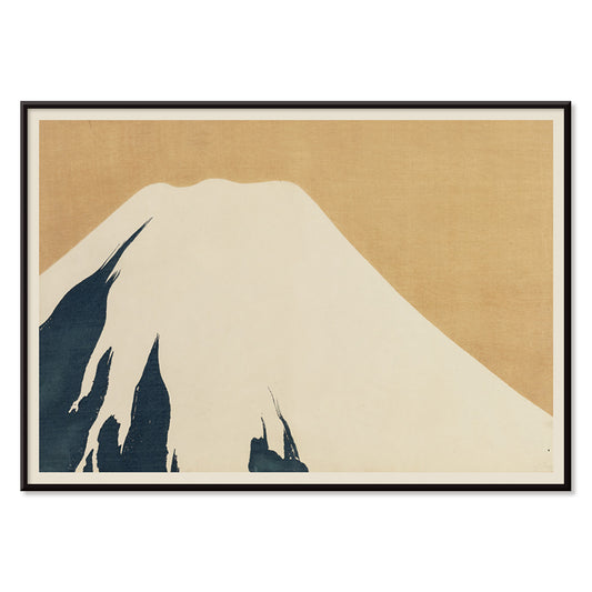
Mount Fuji Poster
Kamisaka Sekka · 1909 · Minimal Mount Fuji art print with calm blue tones and clean contours
Poster from £9 · Framed from £16
Regular price From £6.00Regular price -
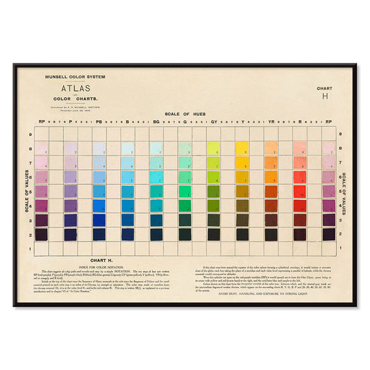
Atlas of the Munsell color system Poster
Albert Henry Munsell · 1915 · Iconic color system poster mapping hues, value, and chroma in a tidy chart
Poster from £9 · Framed from £16
Regular price From £6.00Regular price -
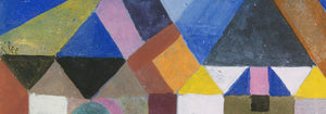
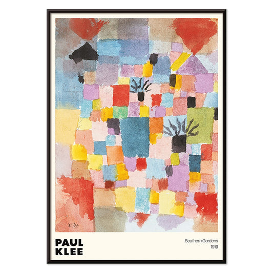
Southern Gardens Poster
Paul Klee · 1919 · Vibrant geometric garden poster with rhythmic blocks of red, blue, yellow, and green
Poster from £9 · Framed from £16
Regular price From £6.00Regular price -
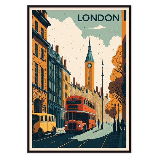
Travel to London Poster
MORYARTY · 1930 · Classic London travel poster with a red double decker bus and clock tower in bold colors
Poster from £9 · Framed from £16
Regular price From £6.00Regular price -
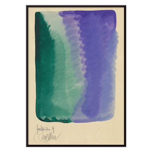
Farbstudien, 10 Blätter IX Poster
Karl Wiener · 1923 · Abstract watercolor art print balancing green and violet washes with quiet modernist rhythm
Poster from £9 · Framed from £16
Regular price From £6.00Regular price -
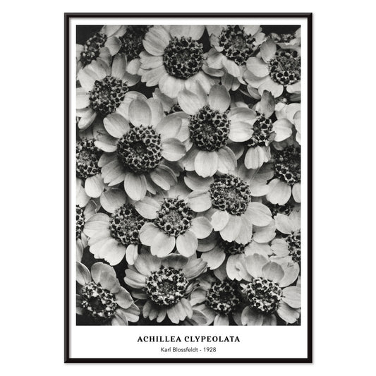
Achillea Clypeolata Poster
Karl Blossfeldt · 1928 · Sculptural yarrow print in crisp black and white with architectural symmetry
Poster from £9 · Framed from £16
Regular price From £6.00Regular price -
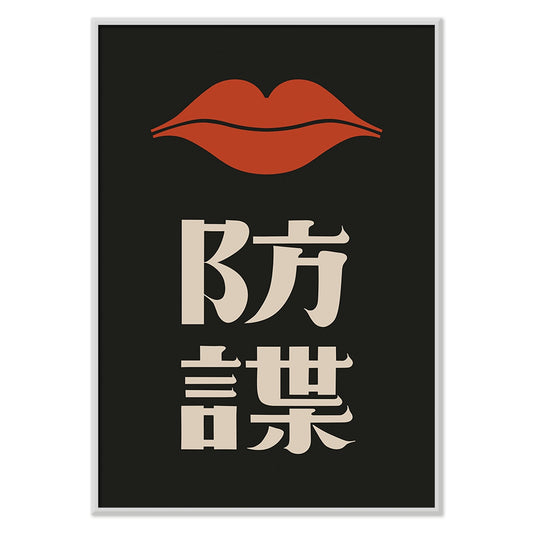
Red Lips Poster
Ikko Tanaka · 1972 · High-contrast poster featuring a stylized face and vivid red lips
Poster from £9 · Framed from £16
Regular price From £6.00Regular price -
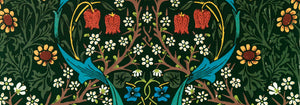
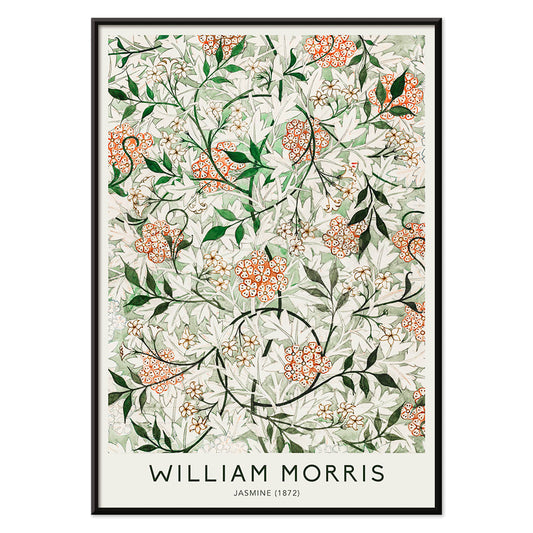
Jasmine Poster
William Morris · 1872 · Ornamental jasmine vine print with dense green leaves and pale blossoms in rhythmic repeat
Poster from £9 · Framed from £16
Regular price From £6.00Regular price -
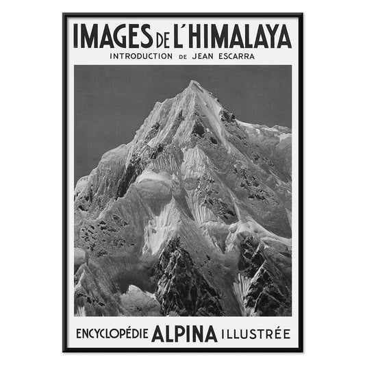
Le Siniolchu Poster
Vittorio Sella · 1899 · Monochrome Himalayan summit poster with crisp alpine light and dramatic snow ridges
Poster from £9 · Framed from £16
Regular price From £6.00Regular price


What Ultrasellers really means
Ultrasellers is not a single era or movement, but a snapshot of images that keep earning space on real walls. These posters share an ability to speak quickly: clear shapes, controlled contrast, and composition that holds from across a room. The appeal is less about trend and more about visual hierarchy, a designerly instinct that makes a print feel stable beside furniture and generous negative space. For a wider survey of styles, begin at All Posters, then return to this edit when you want concentration rather than abundance.
The design logic behind repeat favorites
Many best-loved vintage posters were made to be read in motion, so their grammar is economy. A strong contour survives distance; flat color fields keep the message legible; type is treated as structure rather than caption. That same logic runs through later modernist art print traditions, where reduction and rhythm replace narrative detail. The result is a collection that sits naturally between Advertising and Abstract, two worlds that value clarity, cadence, and deliberate imbalance. Even when an image is dense, it tends to be dense with purpose, directing the eye along a single pathway.
Using ultraseller posters as interior anchors
In home decor, these prints function like visual furniture. An entryway benefits from one confident poster that establishes contrast immediately, especially when the rest of the space is narrow or transitional. In living rooms, place a graphic print above a sofa and echo one hue in a textile or ceramic to make decoration feel intentional rather than themed. For calmer rooms, lean on line, grain, and tonal discipline from Black & White. For spaces that need air and depth, look toward Landscape and give the image a wider mat so the wall art can breathe.
Curating, pacing, and framing without forcing a match
A convincing gallery wall depends on pacing more than style alignment. Pair one high-energy graphic poster with slower reads so the eye has places to rest; a photographic image from Photo can add tonal realism beside flatter illustration. If your set spans decades, let frames do the unifying: warm wood softens sharp geometry, while black profiles sharpen vintage color into something more contemporary. You can keep decisions consistent by selecting profiles from Frames, then repeating the same frame family across different sizes for a quieter rhythm.
Why a crowd-validated edit still feels personal
Online taste shifts quickly, but walls change slowly, and repeat favorites tend to reward long looking. Ultrasellers is useful as a compass: it gathers art prints that people live with, reframe, and move from room to room because the underlying design stays legible in new light. Treat it as a reference point while you build outward into more specific territory, whether that is the painterly density of Classic Art or the pared-back calm of Minimalist.